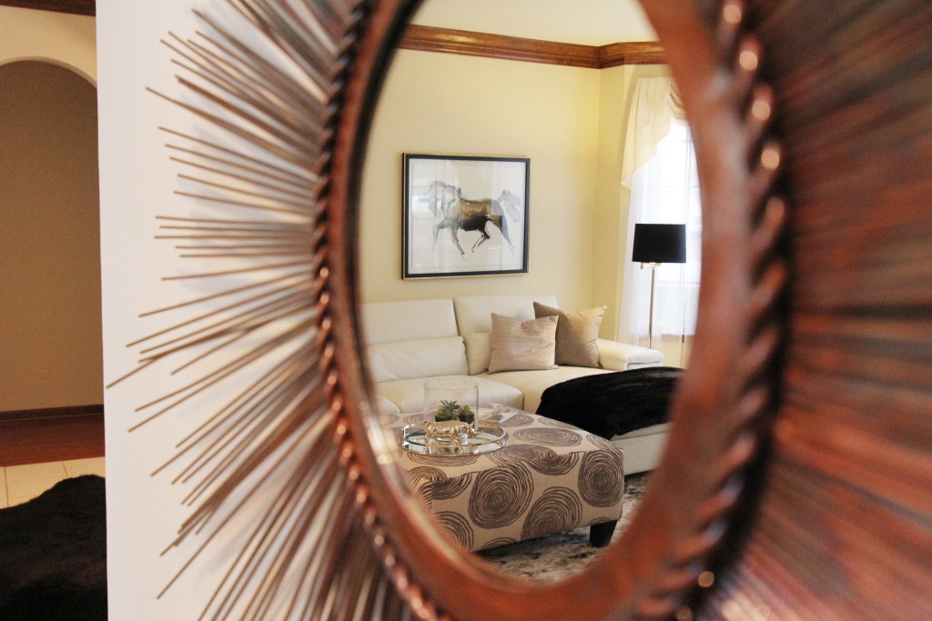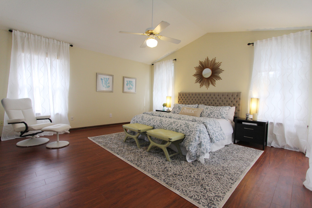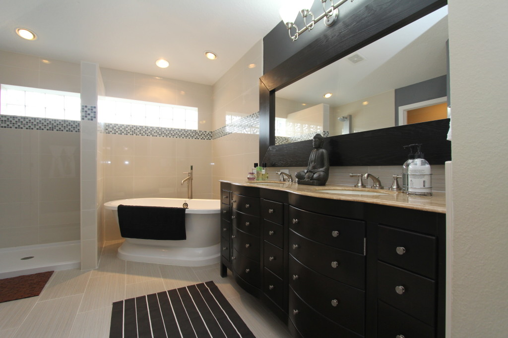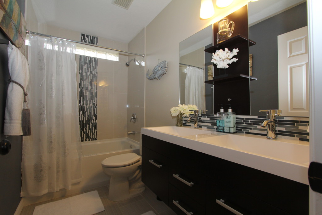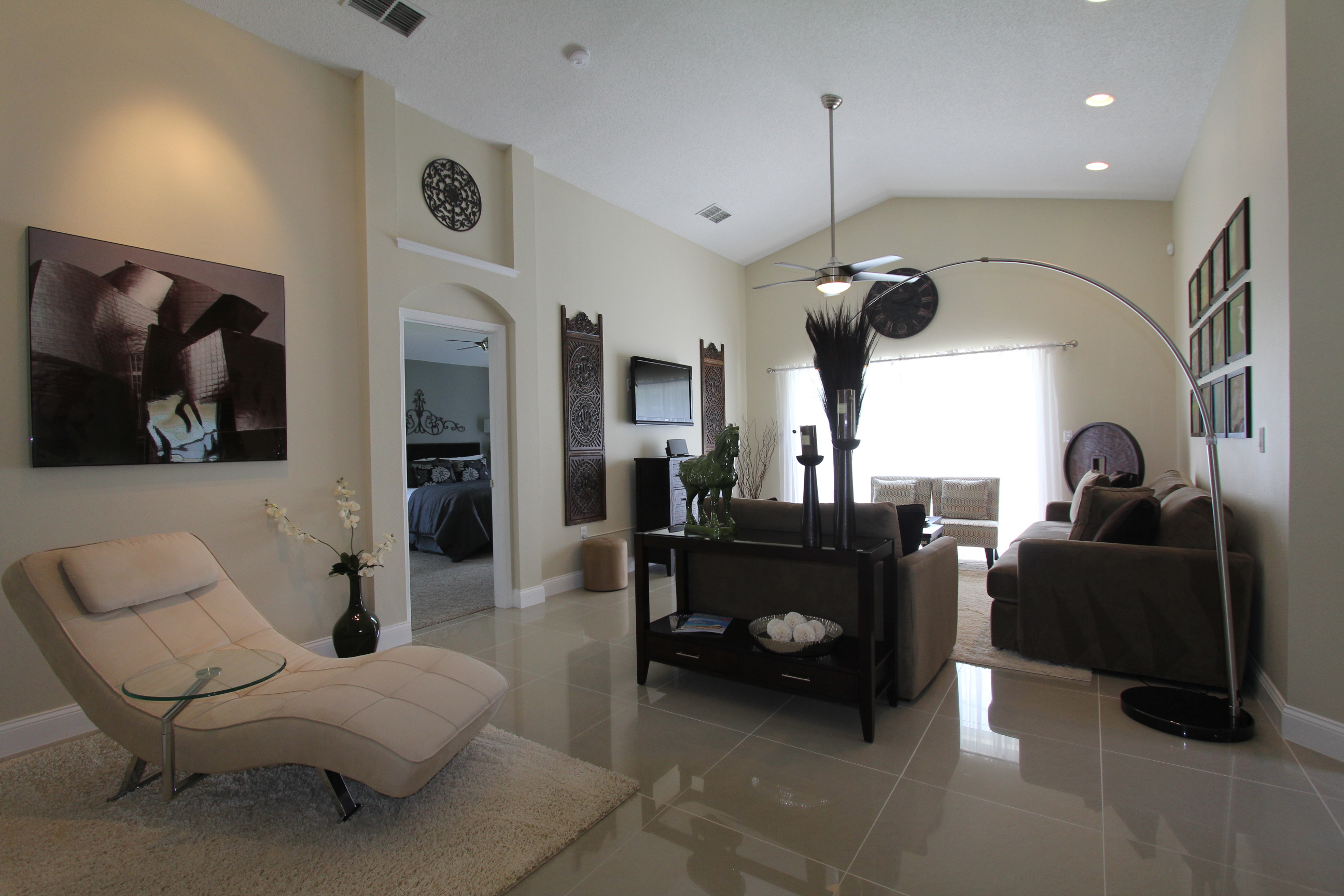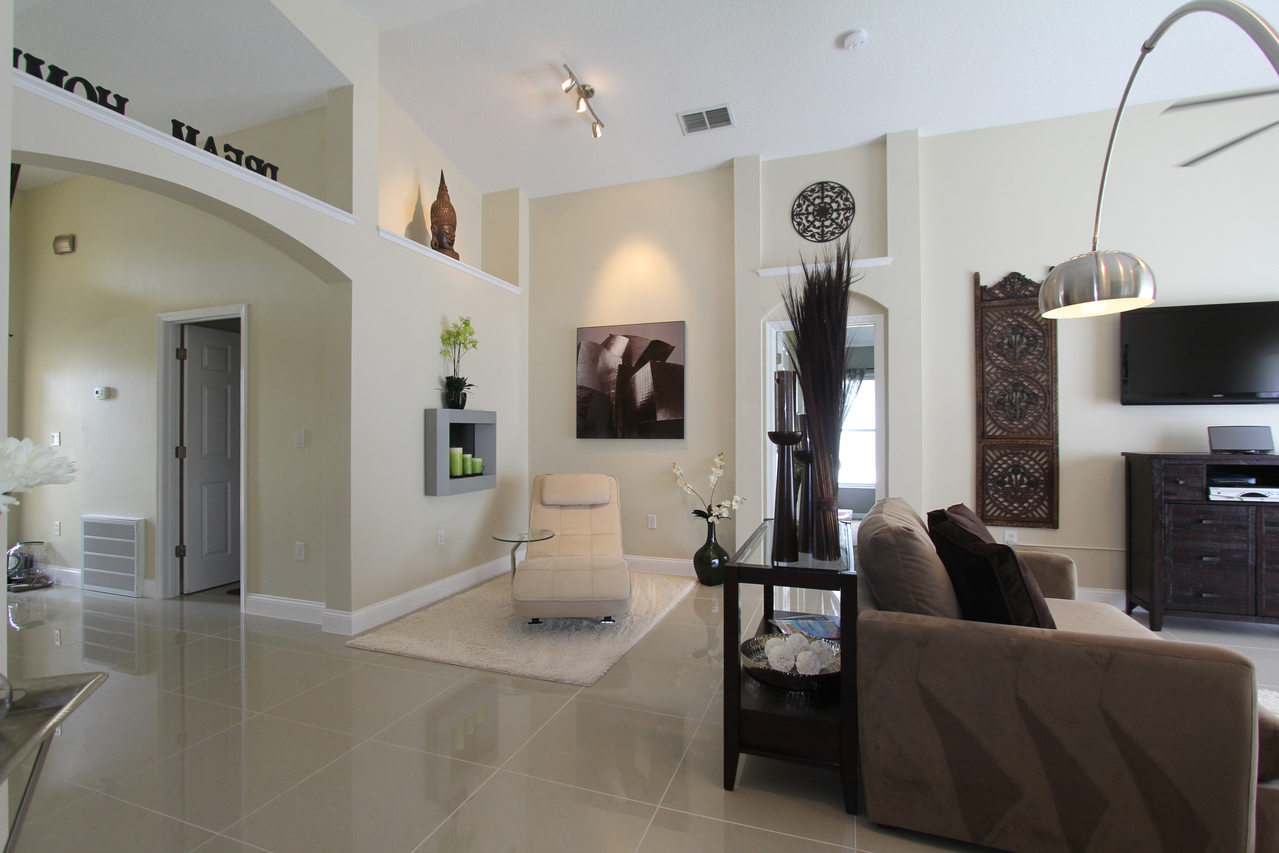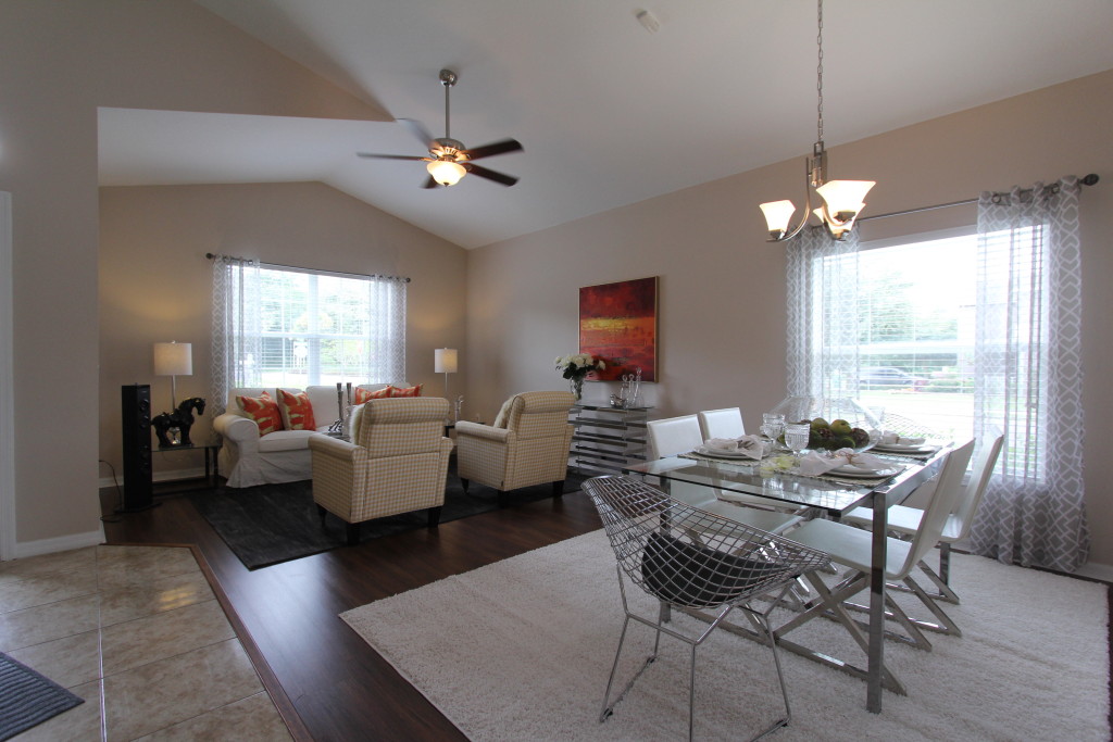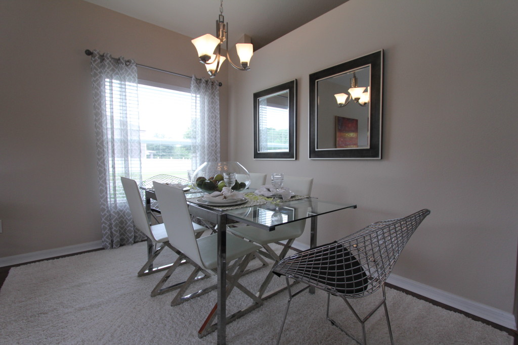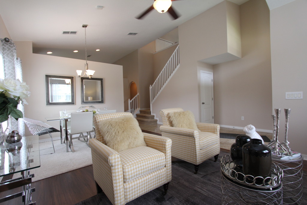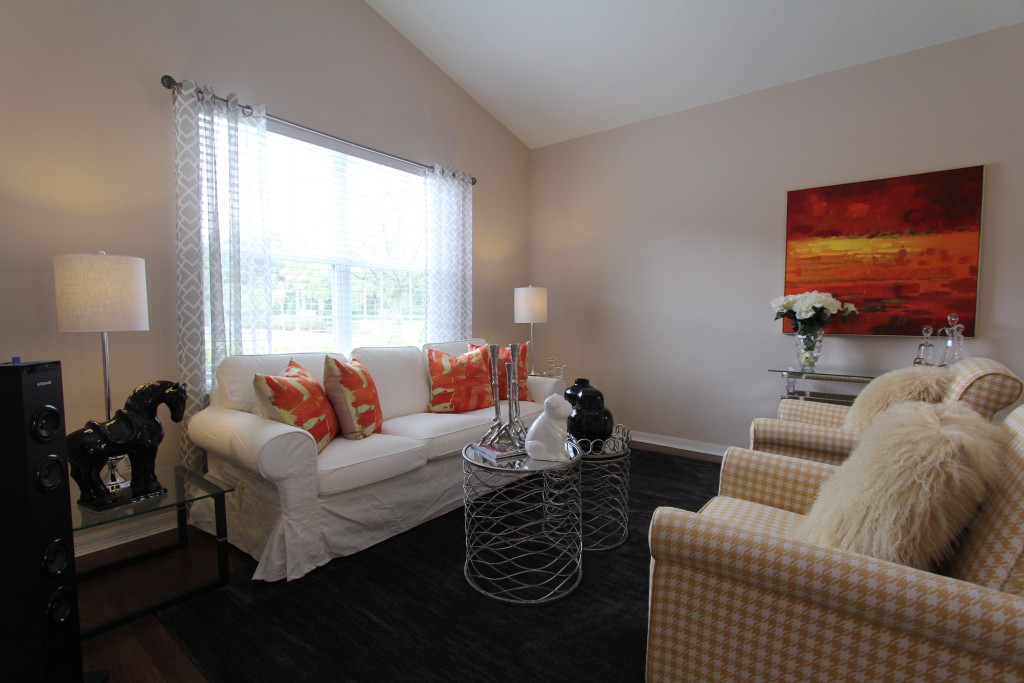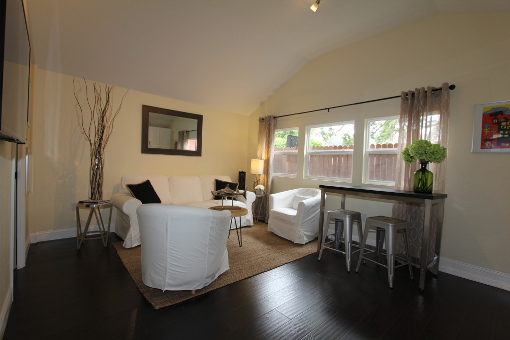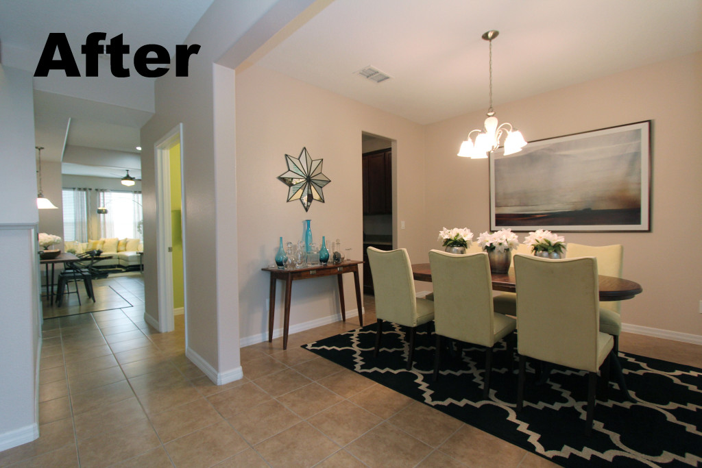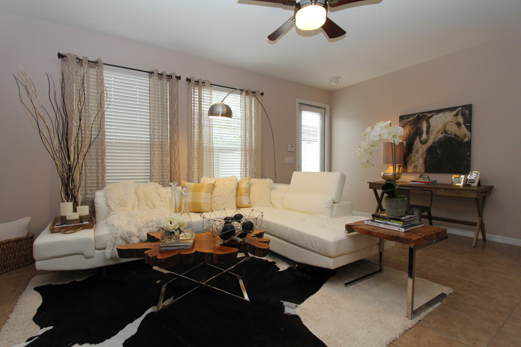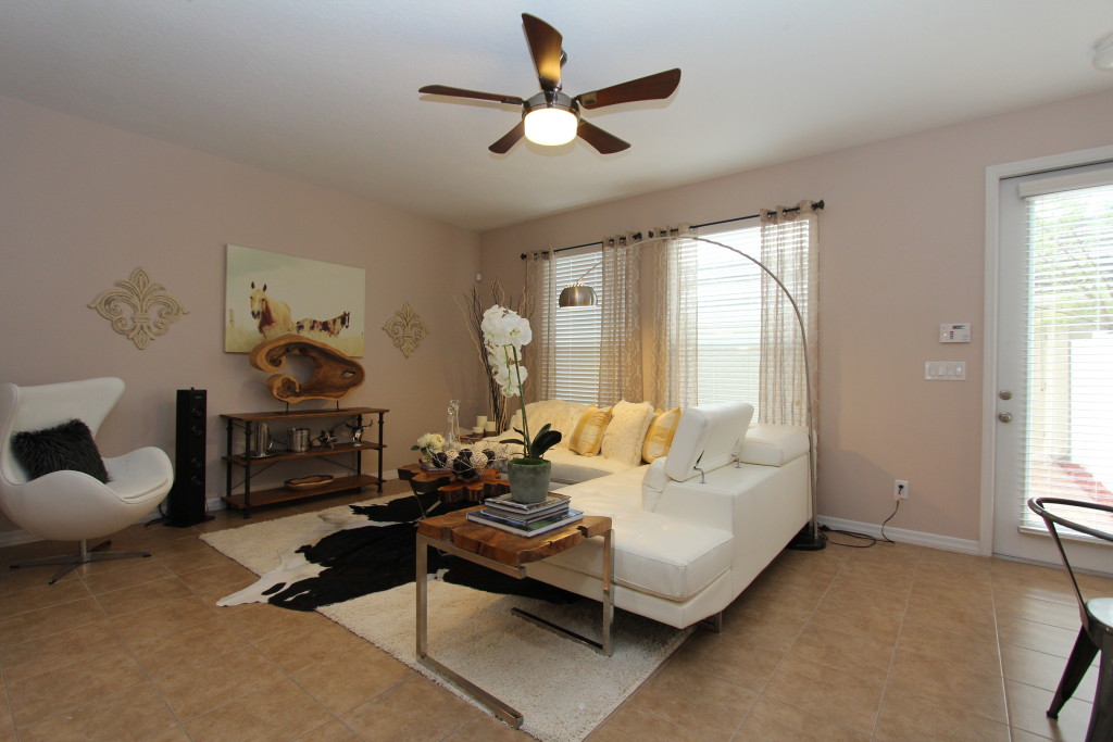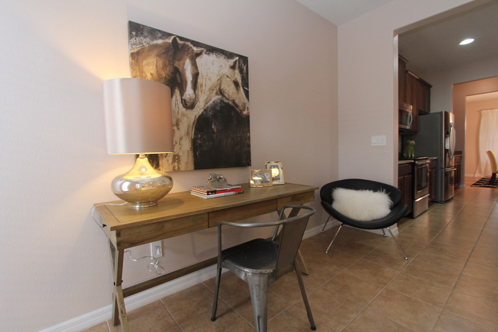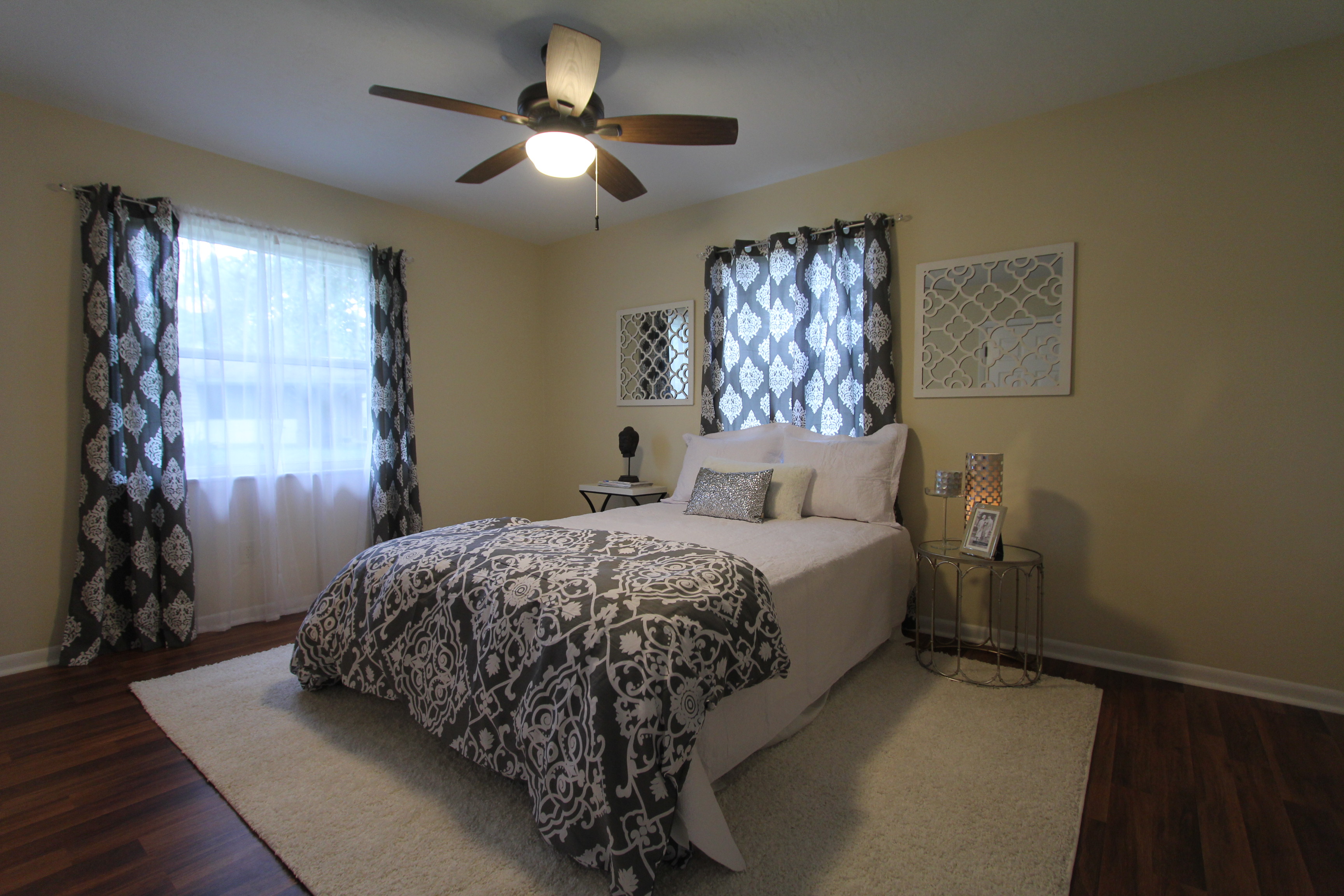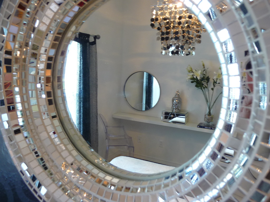
Mirror, Mirror on the wall – How a mirror reflects your style. The question is not why to use mirrors in design but rather why not. Artwork can be very personal and specific and can add great drama to a space. A mirror can do that as well but adds also a different twist to things. A mirror can reflect light where it would be beneficial. So you can use it to highlight an area and use incoming light from an opposite wall as well as reflecting a different angle of the room. It is as you will another viewpoint of the room. So you can take a nice view out of the window and have a mirror project that in another direction. Maximize the assets if you will. The other great benefit is the versatility of a mirror. It is great to anchor a vignette with a console table and fill a wall space. When you have already enough artwork in a room but you want to fill some wall space for a balanced look a mirror is a great option to give you the visual impression you are seeking for. When designing a room you seek for the right balance between empty wall space and items to define the space and create visual interest. You can also use a mirror to mimic somewhat of a window space. There are rooms that are falling short when it comes to window space. A mirror can add that extra bit of natural light by reflecting of the existing windows and bouncing that light back into the room. When placing a mirror it is important to consider what the mirror will reflect from the most likely vantage points of the room. Ideally you want to reflect an angle that adds something to the overall design. You want the reflection to propose an attractive image of the room when you enter. So placement will be key for the successful design. After all, the mirror will be last not least a style statement, just as the other parts of your design. Make sure you have a coherent design concept that integrate the mirror as part of the overall design idea. Don’t let that any item be an afterthought but rather a piece of the puzzle. Consider color, texture and shapes when selecting the mirror. When it accents the room nicely and helps to elevate the design from great to fabulous you made the right choices. You want the design choices to look great and at the same time reflect your design identity.
Category Archives: Interior Design
The power of art
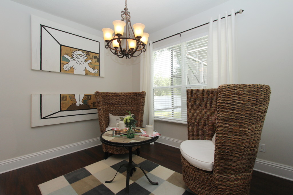
The power of art – Many public spaces are created with architectural focal points that are built around art pieces. They add visual interest and create drama. Consider art as an integral part of your design. There are plenty of choices where you can find great art. If you like original art you might want to visit a local art show to source items that give your home a bit of an artistic flair. If you live in an area without galleries or art shows you can turn to the internet to find great art at good prices. Websites like Vango or art.com offer art on a commercial platform for inspiring artists. Generally one-of-a-kind originals are pricier than prints or glichees, which are replications of an original that often are produced in limited editions series. Generally you should look at size for the space and consider larger pieces for greater impact. In this examples we have a museum quality original called “Angel” in the breakfast nook. Not the typical place to display larger artwork. The art piece is composed of two separate sections and takes up a large wall space. It is one of the earlier pieces of the European artist Alfred Peters. The placement is somewhat unexpected and creates some sense of drama in a more or less conventional space.
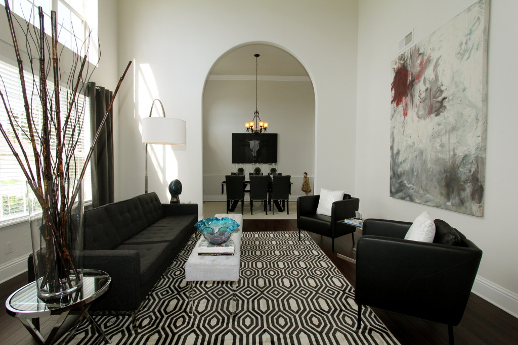
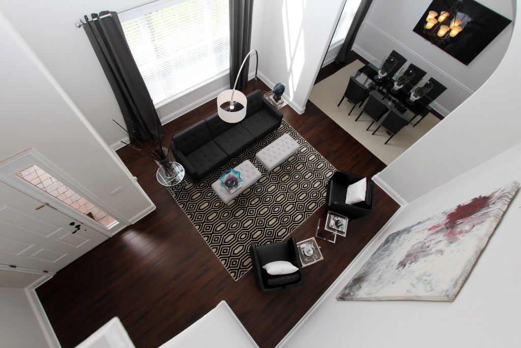
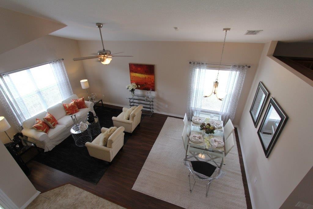
The formal living room is open over two stories. Such a high ceiling is asking for something to give the design composition some height. A vertical format is ideal for this room as it allows to expand up, and to draw the attention to the high ceilings. Here we have placed a unique large abstract by the central Florida Artist Nancy Jay. The piece shows a lot of dynamic movement and vivid red accents that proclaim underlying dominance in the composition. The artist Nancy Jay is well know in the Central Florida region as an prolific artist and educator. Her mostly abstract pieces show an emotional side that is hard to find in her genre. This piece is outstanding and elevate this room from the ordinary to the extraordinary. The furnishings are kept stylish, simple and geometrical. The idea here was to create a room that emulates the appeal of a urban gallery, something that shows sophistication and visual interest. It is the space that visitors see first when they entering the house. We have the opportunity to set the mood and elevate the house to a location that asks to host gatherings and to entertain in. We seek to impress by simplicity, and the artwork plays center stage in this production.
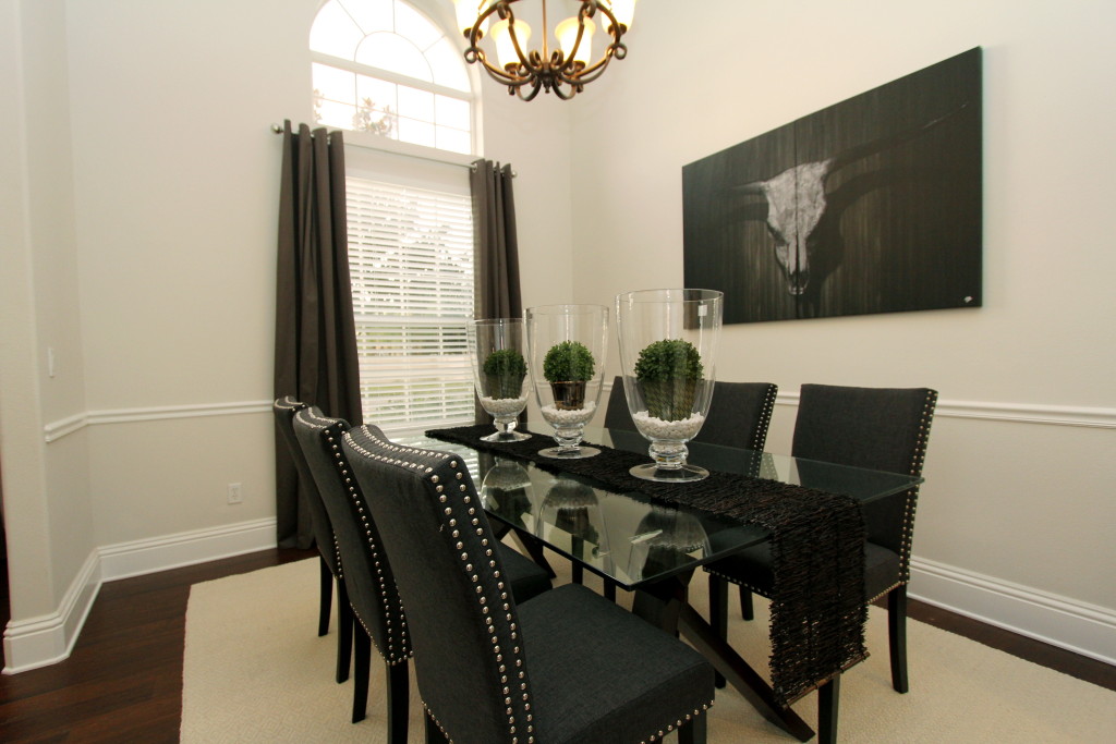
The adjacent dining room possesses equal dramatic lines. The designer had chosen a glass table to show the contemporary side of this room. The chairs are arranged on opposite sides while we forgo the common head chairs at the end of the table. Three glass vases are in line to comment on the chairs setup and to reiterate the orderly form at the table. The artwork appears equally impressive as in the other spaces. Here we have gone with an inexpensive art piece from an online supplier. It works so well because it features the same shades of grey as used in the curtains and the chair fabric or the living room rug and sofa. The sweeping skull of a bull is hiding in the shade while drawing the eye to the dead center of the room. The repetition of the monochrome design helps to increase the visual impact. The fact that we used a rather affordable mass reproduction art piece versus a highly priced original, becomes meaningless from a designers viewpoint. The designer Helene Bonello-Strauss attests that “It is not about the price you pay for a piece, it is all about how your piece conveys your message.” To Helene art can be used to set a mood or to anchor a vignette. She takes art as pawns in her ever changing battlefield, to create order in the chaos of our surroundings. It is a way to find uniqueness in an ocean of conformity, a way to express ones individuality that transforms a space to singularity. “Only if I am able to create something that offers a sense of order and familiarity, while maintaining a tension and visual interest to the composition, I am successful in my approach.” so the designer. “We want to create something people can understand and relate to, while keeping them interested and intrigued.”
If you want to learn more about how you can use art in your interior design, contact us at www.idesigntosell.com for a personal consultation.
Just re-designed 2409 Northumbria Drive in Sanford
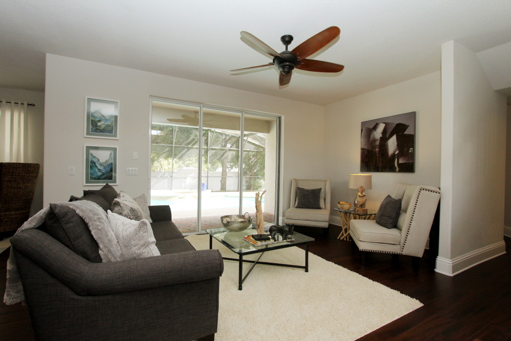
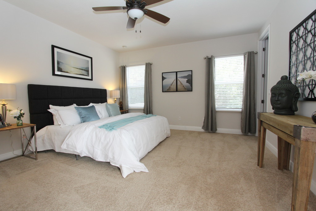
Just re-designed 2409 Northumbria Drive in Sanford – This beautiful two story home got transformed by Interior Designer and Stager Helene Bonello-Strauss. The staging transformation features a modern design aesthetic combined with family friendly appointments. Who says you can not impress your guests while you entertain and at the same time live comfortable and casual in your house. This gorgeous home looks quite polished and stylish. The dominating color in the design concept is a rich dark grey that finds it use throughout the space in the curtains, sofa, dining table or master bedroom headboard. The use of fabrics lend itself to a tailored look.
See the walk through video for a more personal impression of the Sanford listing that is on the market right now. Please feel free to share and re-post.
Just staged in Winter Park: A small house with a big attitude
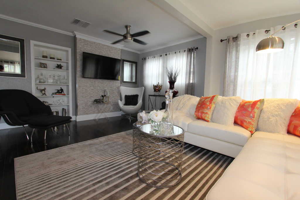
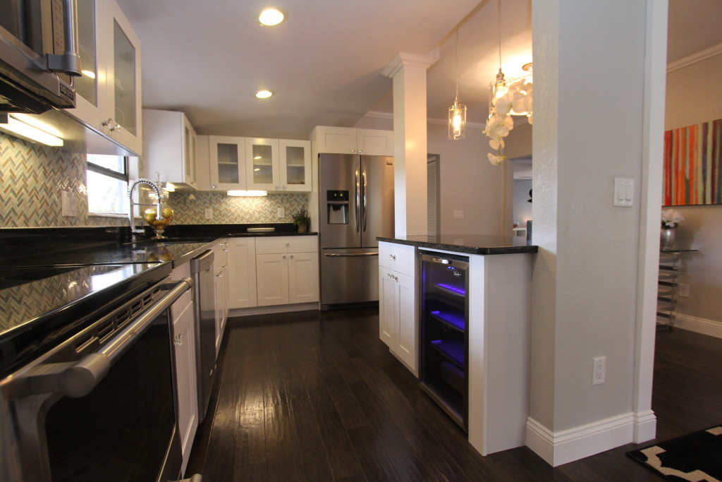
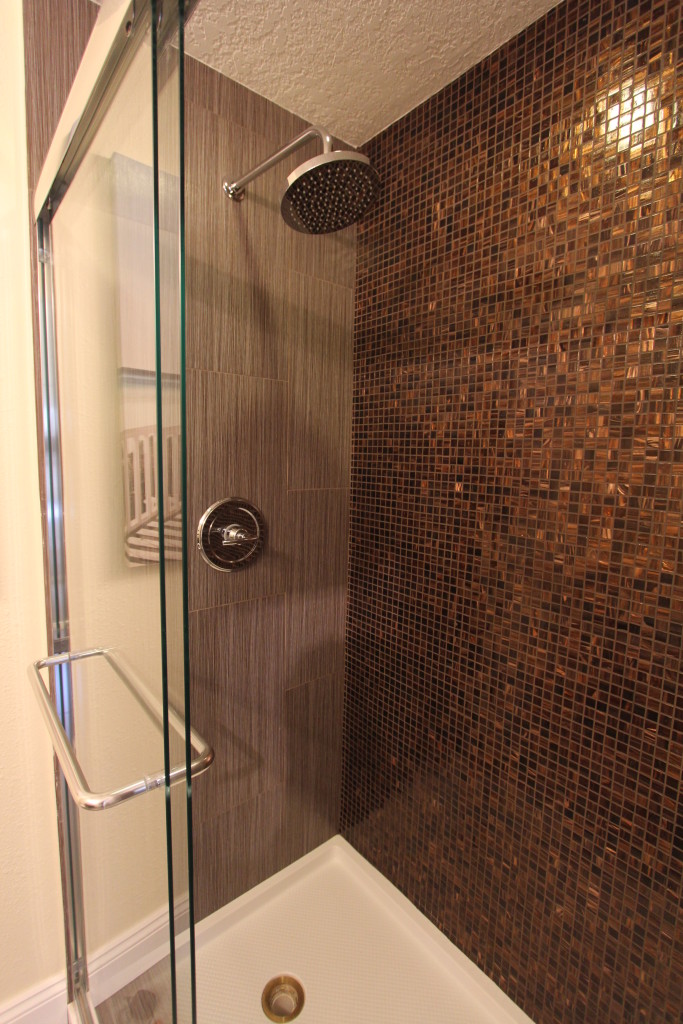
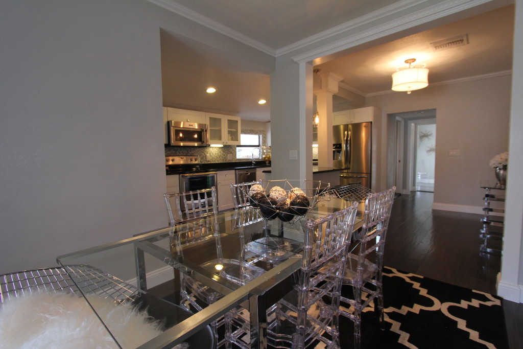
Just staged in Winter Park: A small house with a big attitude – Realtor (R) Michelle Forbes just completed the renovation of this gorgeous 3 bedroom 2 bath home in Winter Park. The update included a gut renovation of the bathrooms and the kitchen, among other cosmetic improvements. The result is tremendous. This house offers fantastic features with its granite counters, new high quality cabinetry and great fit and finishes. The staging for this cozy split plan home provided exactly what this house needed. It shows how the floorplan can be utilized without infringing on important traffic space. A small house can have it all; it just needs to be designed correctly. The 3 seater sofa with its modern lines offers comfort and style. We added accent chairs that do not have wide armrests. It is a great way to add seating without using a lot of space. The chairs are quite comfortable and provide a perfect scale for the room. The dining table seats six and demonstrate that this home is ready to entertain guests. The secondary rooms are nice sized and we set one up with a queen bed and one with a twin bed. The master suite boasts a king size bed with room to spare. This house looked small before the furniture showed how the rooms scale really translate. Now we can demonstrate that a little over 1200 sq ft can have a great impact. It is not about sheer size but more about what you do with the room. There is a national trend to downsize while some families even consider tiny houses. This beautiful home in Winter Park shows that less can be more and one does not have to live cramped and without style. This staging brings out the fabulous side of the house, and is proof that one does not have to spend a million dollars to own a stylish abode with a Winter Park address.
Creating a dramatic accent wall
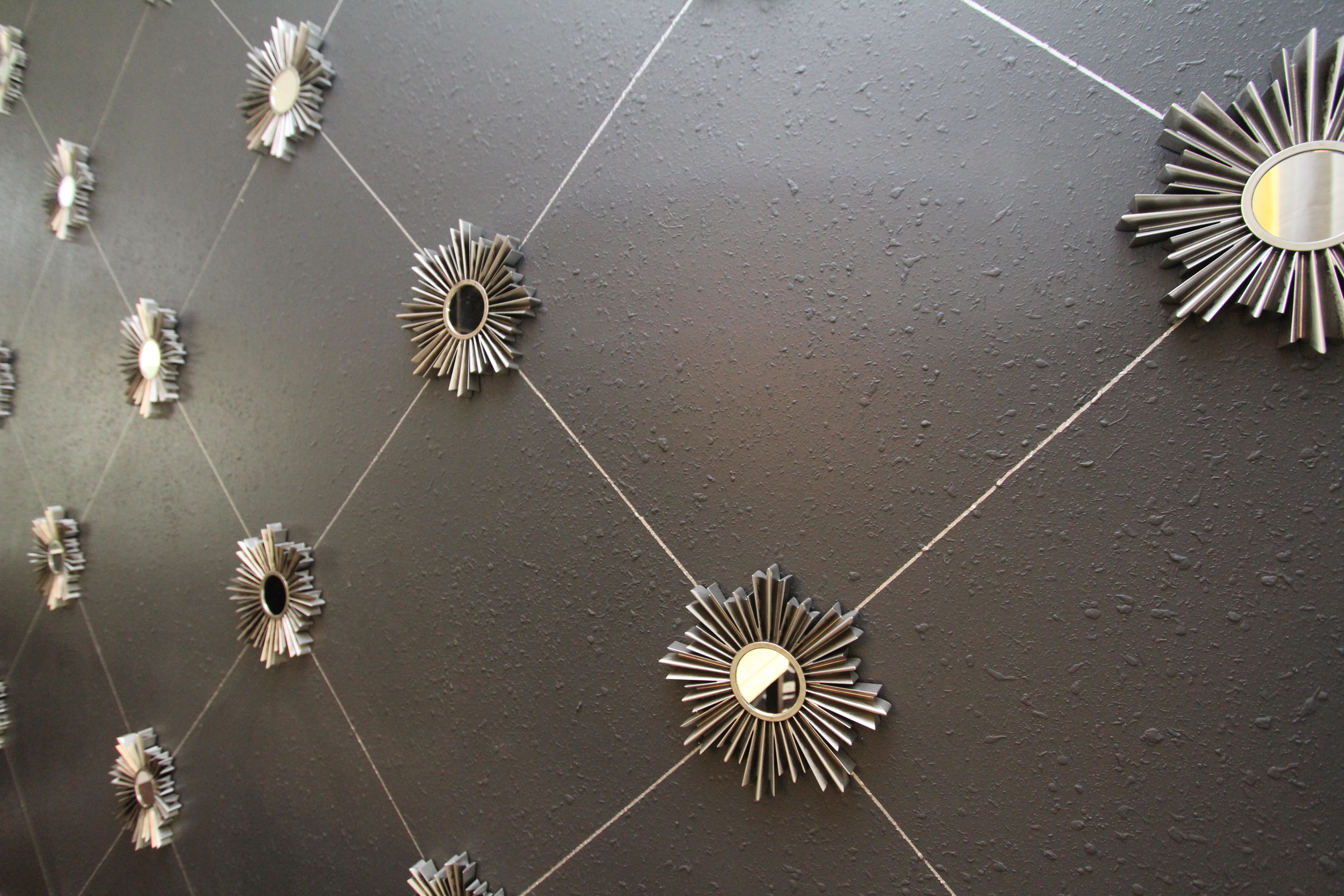
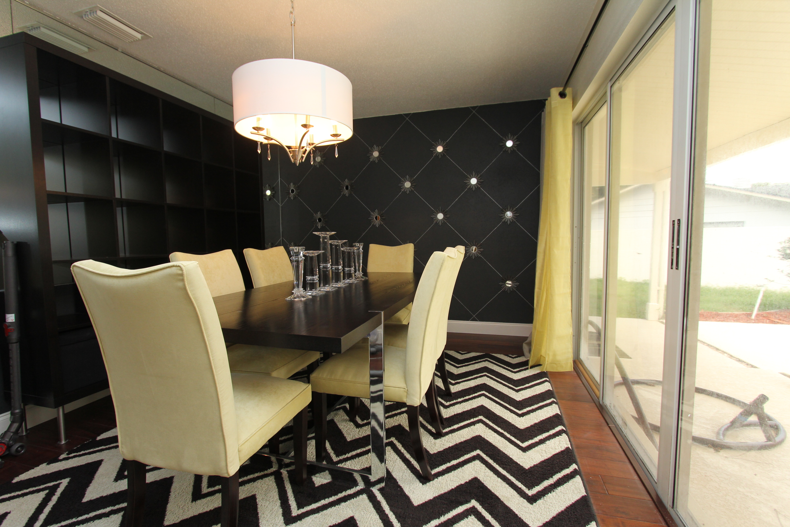
Creating a dramatic accent wall – Sometimes a room can benefit from an accent wall. The designer Helen Bonello-Strauss uses often the wall opposite the door that leads into that room. “I want the accent wall to be the first thing a person see upon entering the room.” The accent wall can be done with a contrasting paint color, Wallpaper, or a treatment with tile or wood. The only limit is what creative limitations you set yourself. Here is an example how we set a wall apart with an easy and cheap way to create some great interest. The wall was painted in a dark grey. The designer found some inexpensive mirrors online at a design supply warehouse. She ordered up a few dozen of the mirrors and used them in regular patterns on the wall. The lines between the mirrors were done with a long piece of scrap wood as a ruler and a silver felt tip pen from the craft store. This treatment play homage on traditional designs and wall coverings while leaving the wall undamaged in case someone would want to change this wall back to a simply painted surface. This treatment cost less than $ 200 for the whole wall and a few hours of work. Anyone can do this at home. All it takes is an idea and a free afternoon.
Just Staged – a 6 bedroom home in Orlando’s popular Conway area
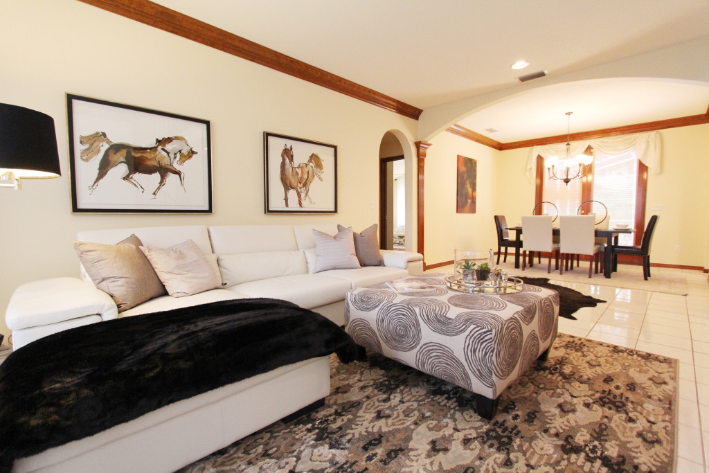
Just Staged – a 6 bedroom home in Orlando’s popular Conway area – If you are looking for a house with space and plenty of bedrooms this newly finished staging project might be worth a look. Listed by Realtor Scott Butts this property on Pecan Lane in a community off Gatlin offers a lot of square footage for the $ 379k asking price. It is 3,541 square feet under air and heat with a total space of 4,461 sq. ft. under the roofline. This pool home has three bedrooms on the first floor, and 3 on the upstairs level. We have decorated one of the downstairs bedrooms as an office. The goal was to show off the hardwood trim work and create a color scheme that makes the wood color work well in the space. We repeated the wood tones in accessories and the furniture and kept a neutral palette. The formal living area received an understated modern sectional to show that a transitional/contemporary design concept can work well in a house with plenty of traditional features. We use black as the accent color to enhance the contrast. Here in the living area the throw and the picture frame, as well as the lamp shade, has the same dark accents as the dining table and the newly installed Chandelier. This room is proof that an accent color can be black and technically a total lack of color. Sometimes it pays off to ignore the rules and try something different.
How HGTV is screwing up the sale of your house
“Why?” You ask. The real estate interested buyer has seen on countless TV shows on channels like HGTV, DIY Network and a half dozen others what an army of contractors, designers, and stagers do to properties to make them more salable. They are willing to pay a good price for their next home but they know exactly what they want. They want updated floor plans. They want nice upgraded features. They look for granite counters, stainless steel appliances, nice wood floors, updated light fixtures and most of all a designers vision of what the property could look like. They want to be wowed, they want to be impressed. They have seen dozens of homes on TV that look like a million dollars, and some that are actually worth much more than a million dollars. You, as a potential home seller, are not only competing with your neighbors who are selling their homes, you are competing with the vision buyers have on how their new home should look like. They have seen bathrooms they like, they have seen kitchens to die for, and they already have a laundry list of items they are searching for. Unfortunately the faded wallpaper from the time your house was built did not make that list; Nor does the worn laminate countertops or the beige carpet in your living room. If your house looks in the buyers mind anything less than perfect they will not make an offer or at least deduct a considerable amount of money on the price they are willing to pay for the property. If you do not create a vision on how the property should look like and how buyers would see themselves living in the house your chances of a sale drop significantly. The new generation is all about individuality and the expression of their lifestyle. It is a generation that is used to have instant gratification. It is not the generation that saved up for a decade or two to buy a house. They want it now! They don’t want to go through a long drawn out process of renovating a house but rather have a turn key property ready to move in. Buyers today have certain expectations in life. They have an idea how their lifestyle should be, and how their house will help them achieve that goal. They have a vision that they look to make a reality. They have seen it on TV. The endless shows of fixer uppers, flipping, decorating and contracting might not have schooled them on how to achieve the results themselves, but it certainly has taught them what they are looking for in your house. If you are hoping for a top dollar sales price you better ‘up’ the game and get ready to deliver. You should seriously consider having a design professional on your team. Remember, your buyers are listening to professional designers for years.
Don’t be afraid of dark colors
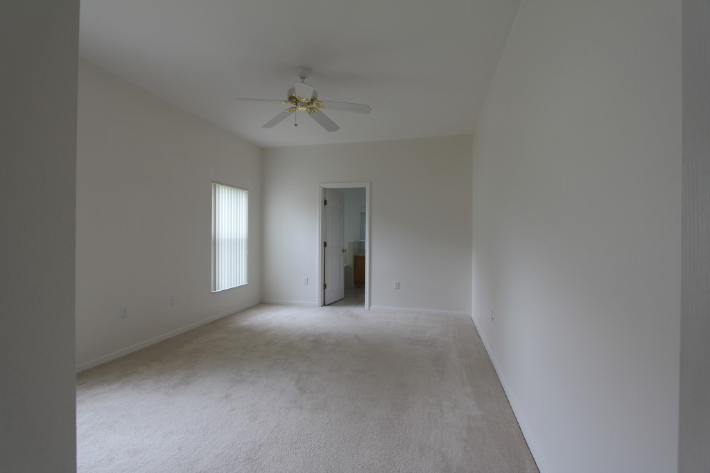
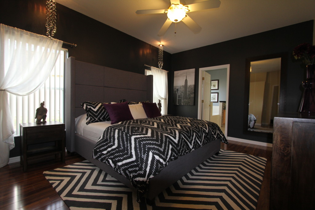
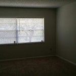
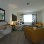
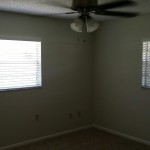
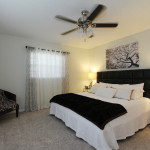
Don’t be afraid of dark colors – While often times dark colors can be perceived to make a room look small or uninviting, there is an upside. It is true that dark colors will absorb more light than bright light ones. So a room with dark walls will reflect less of the light coming in. However it can make a space look more intimate and can add drama to it. It also can make the walls less refined and make the space actually appear larger. So the walls disappears into the dark color. The picture below shows a bedroom that received a treatment of the ‘dark side’. The first picture shows the room with beige carpet and white walls. Nothing wrong with it except that is was so boring, it would put any guest to sleep regardless the time of day. The design solution to this room was to bring visual interest through texture and patterns and a dark rich color scheme with greys, blacks and natural wood tones. The high gloss wood floor got accented with a chevron patterned wool rug. The walls received a satin sheen dark anthracite wall color with a hint of blue and red in it. The bed with its large grey headboard brings drama to the room and leaves enough contrast to the walls for a great impact. To lighten up the space the designer Helen Bonello-Strauss added a large mirror to bounce off some light on the far wall. Instead of traditional table lamps she opted for bubble chandeliers hung from the ceiling. The downward pointing light works great as reading light. The bedding picks up the chevron pattern in the rug and carries the design theme further. While the room shows drama and strong dark tones is offers a cozy and warm appeal through the use of wood and fabrics. It is a great way to showcase your dark side while staying in style.
How to use shine as a design element
How to use shine as a design element – Color and form are important elements that one should consider in design. But the surface textures might be as important to your final product as other aspects of your design choices. This example of a vacation home was sold sight unseen from the pictures provided. The buyer fell in love with this cheery remodel home even before setting foot in the house. Instead of the typical choice of carpet or wood floor the Orlando interior designer Helen Bonello-Strauss took high gloss porcelain tile as the floor covering to give this house some style. With 1400 sq ft this house is not the biggest in the neighborhood. So the fit and finishes had to make a lasting impact. While the bedrooms received a frieze carpet for a warm textured look, the living area, kitchen, and wet areas show a large 20″ tile with white high gloss finish. The spaces flow seamless and the contractor was able to lay the tiles in all the traffic areas without interruption or change in pattern so that no threshold would interrupt the flow. The grout lines in a matching white were tiny with 1/16 of an inch and almost disappear. The reflective surface makes the light bounces of and gives you some mirrored effect, opening the space and offering a clean fresh look. The maintenance aspect of this floor is undeniable. Easy to wipe down and hard wearing, these floors are deemed to last. The house quickly found its use as a vacation home, that is rented out during the time the owners don’t have use for it. The durable floor itself helps to curb maintenance efforts and cost. The contemporary style with the oversized comfortable furnishings deliver the promise of a relaxing time in stylish surroundings. Who would not want to stay in such a place? You want your house to shine in all it glory? You may want to consider a smooth move. Even if it means for you subscribe to a high gloss lifestyle.
See the staging transformation of a newer home in Deland Florida
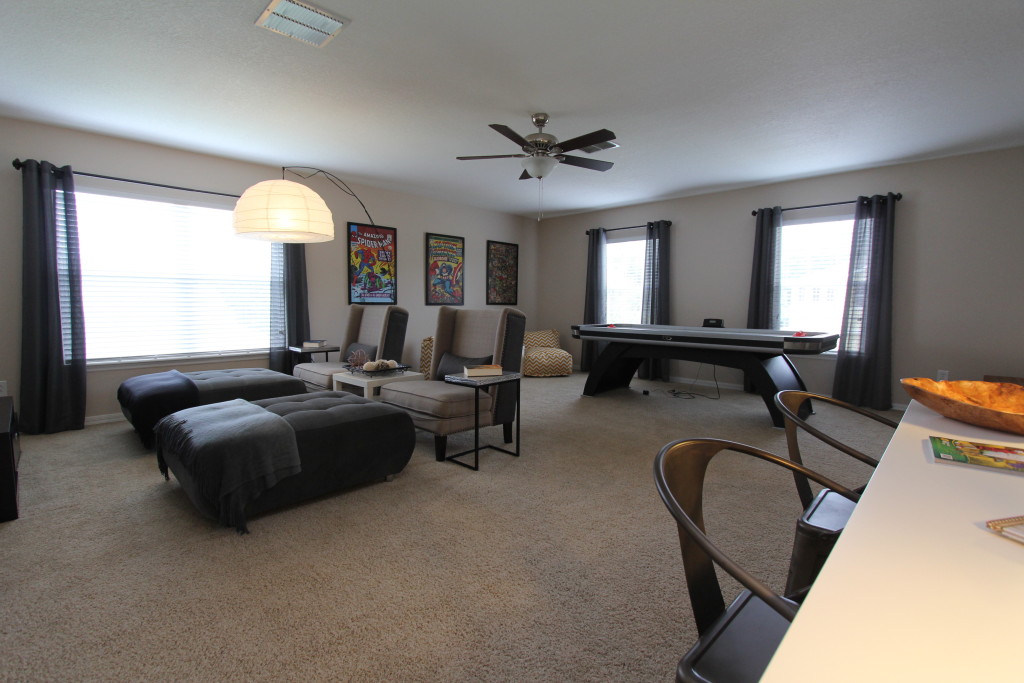
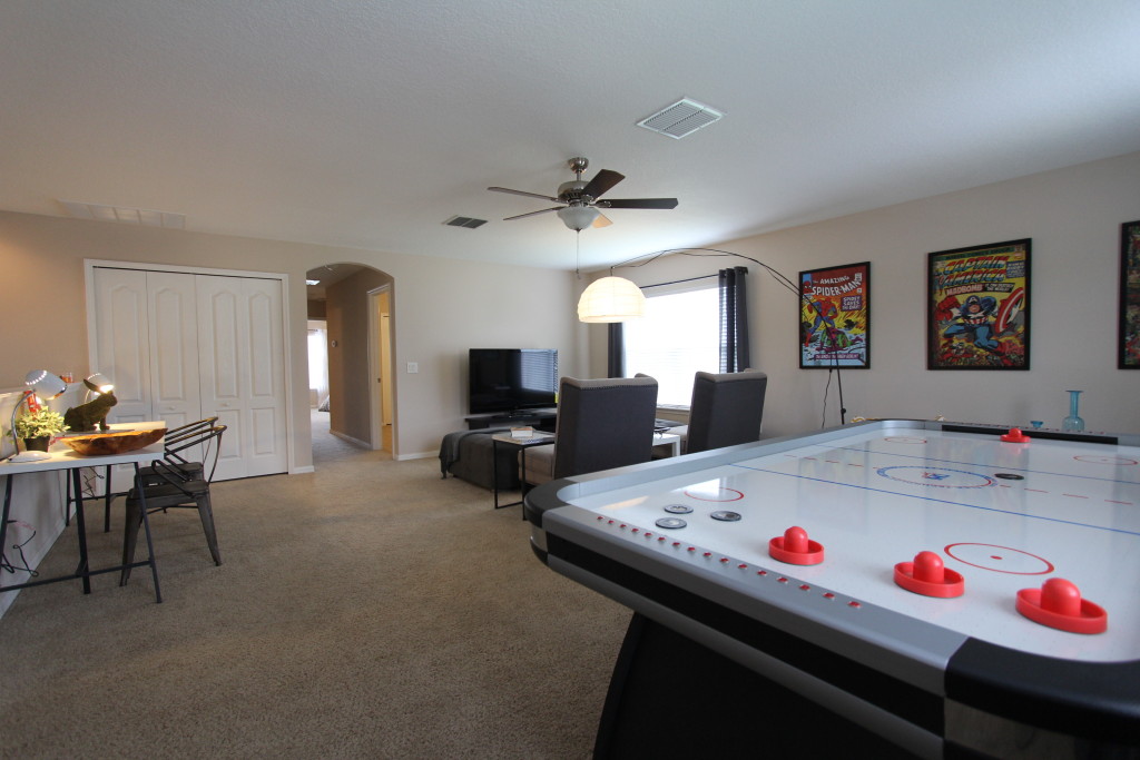
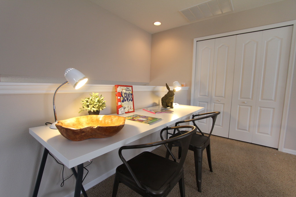
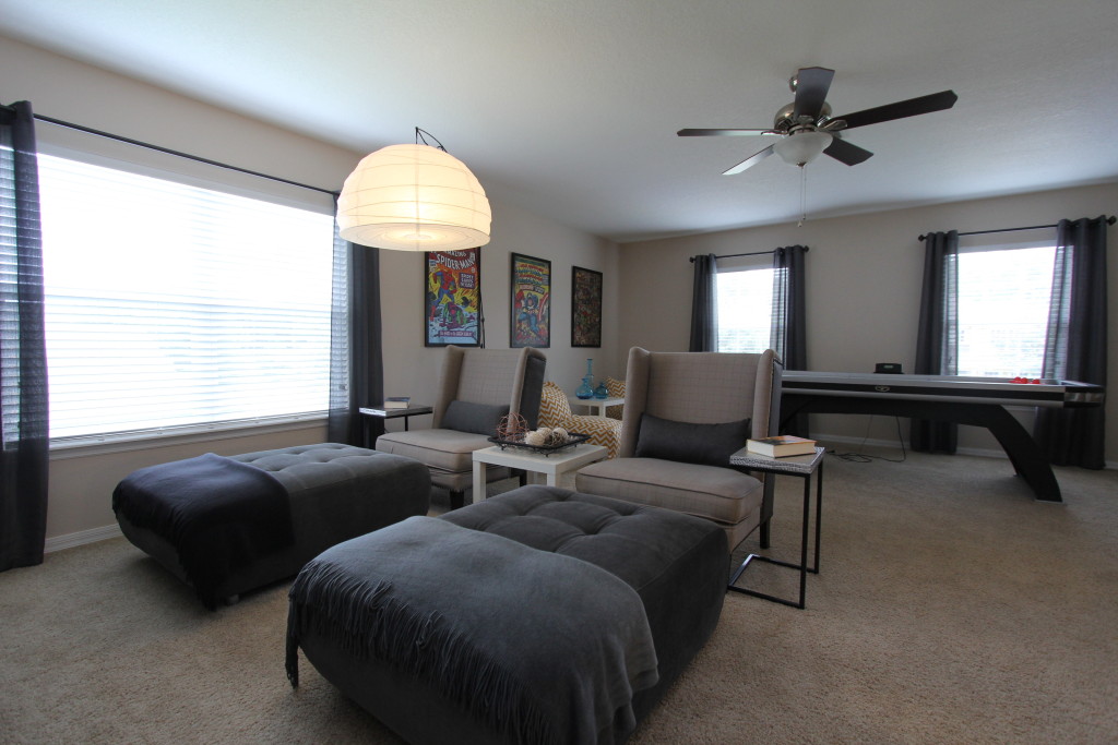
See the staging transformation of a newer home in Deland Florida – This property located in the nice and quaint college town Deland Florida left not much to wish for. The spacious home boasts over 2800 sq ft of living area under air and heat. There are formal living and dining room, the kitchen that opens to family room and a matter suite on the first floor. The second floor has three bedrooms and a large open loft area. All spaces were quite nice sized and renovated, but the empty house did not offer much that makes a buyer remember it. It was priced very competitively well below some other comparable sales and remained unsold for three months. Interior designer and decorator Helene Bonello-Strauss came in to give this listing a competitive edge. Her first order of business was to convince the owner to replace the carpet in the formal living area with a nice dark laminate floor. She also recommended to add a French door refrigerator to the kitchen. These changes already make a difference with many buyers. Especially young families are cash strapped with the cost related to their real estate purchase. An expensive refrigerator included in the transaction saves the buyer cash funds as they are able to roll the extra price into the financing. The staging created a tremendous change in the property. The combined formal living and dining now looks stylish and up to date and provides clear defined areas to socialize with guests or to have a meal together. Although the room received a new wood floor, Helene used area rugs to give the different spaces some separation and anchor the furniture as vignettes. The family room of the kitchen got fitted with a comfortable brown leather sectional. The material and color suggests a comfortable and durable spot for the whole family to hang out. “The loft area is the selling point”, so stager Helene Bonello-Strauss. She imagined the most likely buyer for this house to be a family with children. The open flex space upstairs should be a living and play area dedicated to the children and their friends. So the designer fit the room with a TV area where some oversized chairs invite visitors to kick back and watch a favorite movie or game. The ottomans function as a chaise or offer additional seating when needed. In addition there is a desk space that allows the kids to do homework or explore their creative side with arts and crafts. The air hockey games table is the eye catching wow factor for the youngsters in the purchasing party. The designer finds it important to cater also to the children when designing a house. Yes, the adults are the ones who make the ultimate buying decision, but if the kids fall in love with the house the chances of a sale are exponentially larger. The association of realtor’s identify school location and additional space requirement for the children two of the main motivators for a move. This loft area is designed to be a hit with the younger crowd and offers so many uses with different seating, play and entertainment options. Hey, who knows – dad might want to occupy the space with his friend for some weekend sport watching. One thing is for sure: this transformation is deemed to be a hit for the whole family. We keep our fingers crossed and will report back once the property went under contract. If you know someone interested in a house in that area have them contact their Realtor. The address of that property is 720 Gordonia Ct, Deland FL 32724.
See what some interiors will do to a Deltona home
See what some interiors will do to a Deltona home – The newly renovated home needed something extra to make it stand out. The listing agent Cherie Price with Re/Max Central Realty had seen other properties that were transformed by the interior designer Helene Bonello-Strauss. Cherie Price wanted that feel of luxury and a comfortable atmosphere in the home, so she hired www.idesigntosell.com to assist with a temporary staging transformation. The four bedroom home received a staging in the living areas and two of the four bedrooms. The window treatments and area rugs helped a lot to add texture and warmth to the empty space. The living area had all tiles. That made the empty room look a bit cold and uninviting. While many other stagers do not add curtains or area rugs, Helene felt that those were essential to the success of the transformation. “Especially with large tiled rooms you want fabrics in there to overcome that ocean of hard surfaces”. Area rugs help to anchor the furniture and improve the acoustics in a room. The window treatments also help to soften the room and add visual interest and height to the design. This Deltona home is available for sale at a very reasonable price. Anyone interested please call the listing agent Cherie Price at 386-956-0006 or contact your local Realtor (R).
Tip: Refresh your bathroom without major renovation
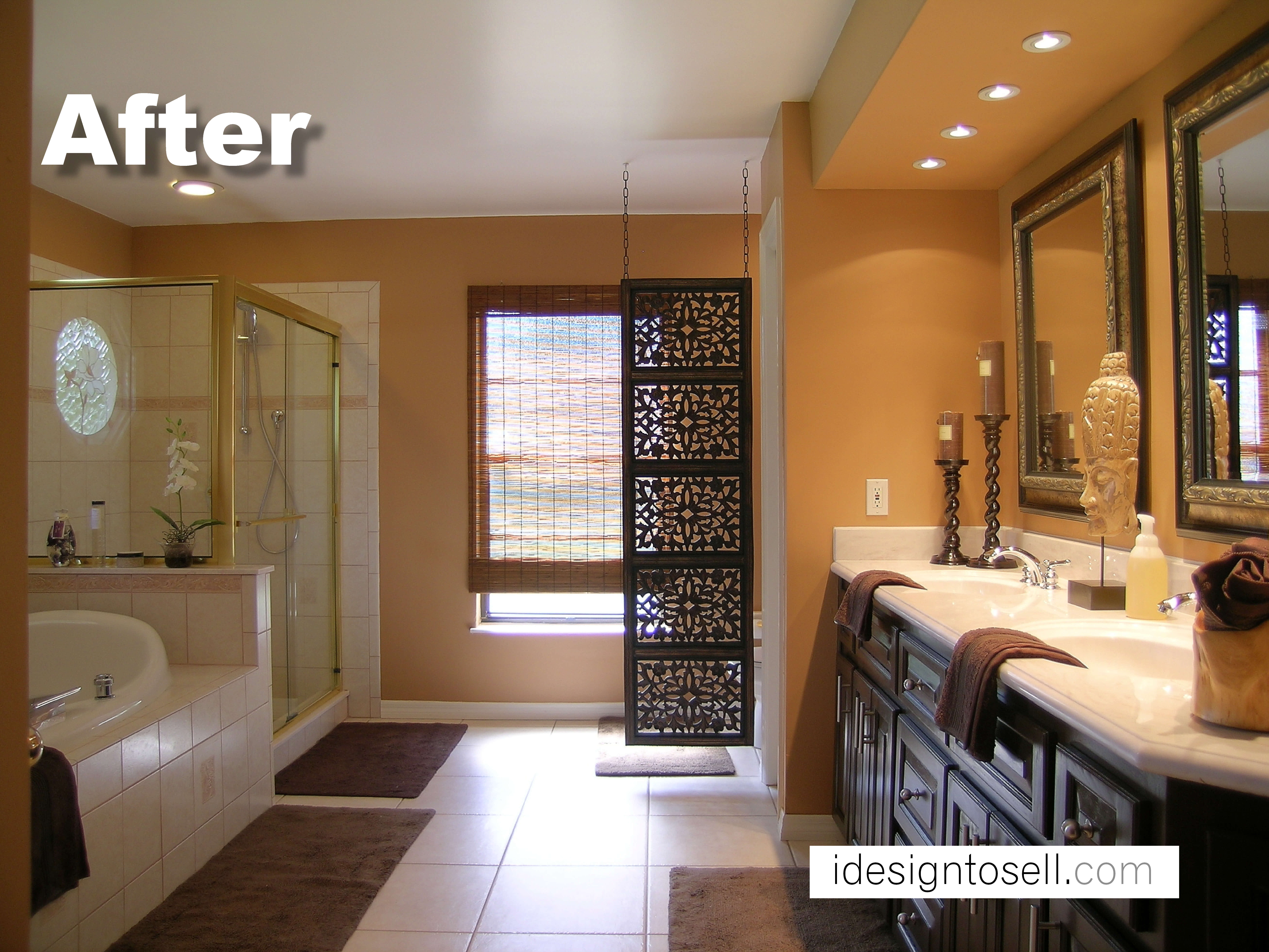
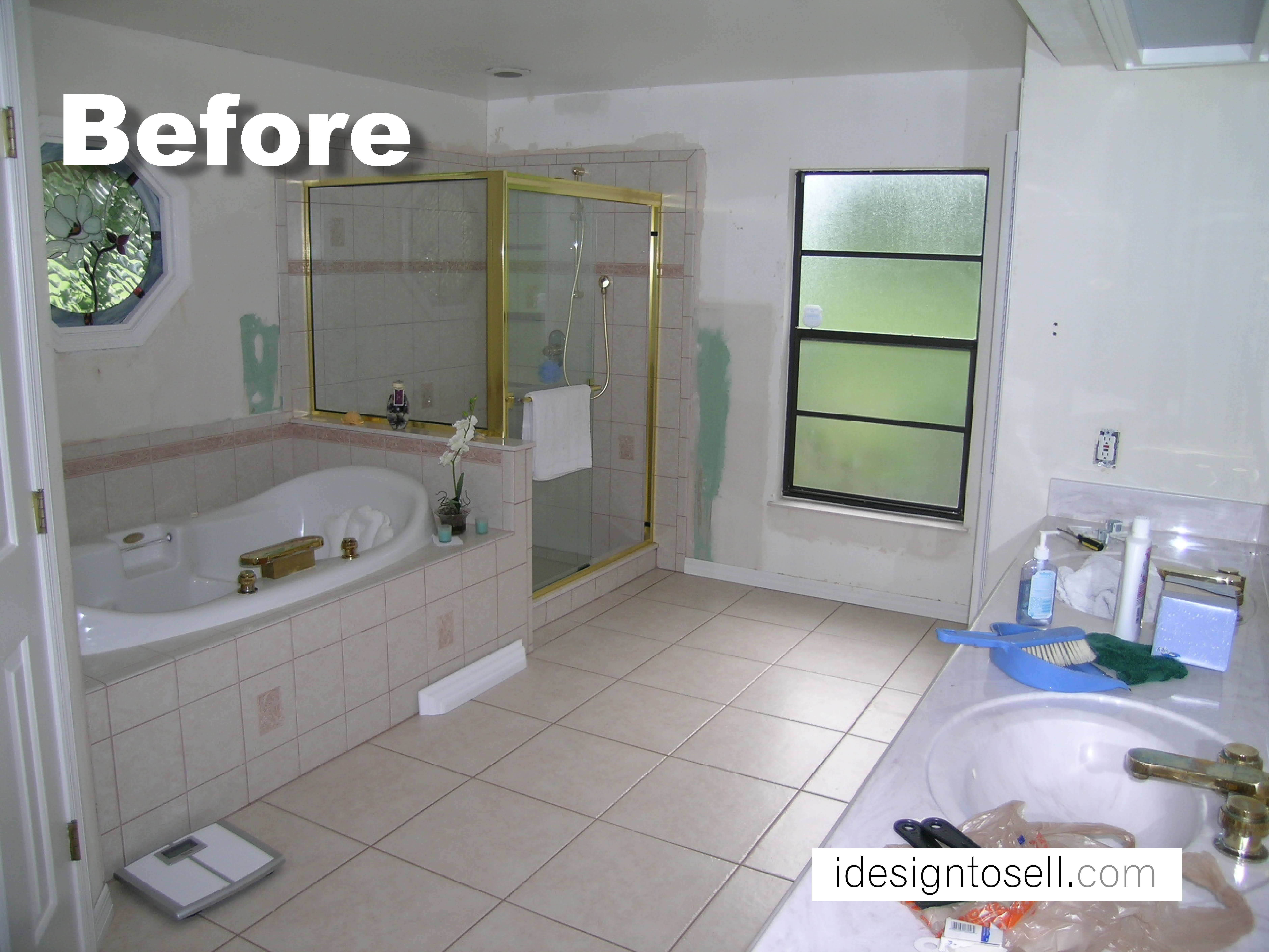
Tip: Refresh your bathroom without major renovation. Kitchen and bathroom renovations add the most value to your house but typically are also quite costly. Some times the basics are still in a good condition so that some smaller cosmetic changes can make a big difference. This master bath had dated flower wallpaper that was already removed in the “before” picture. The oak cabinetry showed wear and tear and the vanity has some florescent lights overhead that created a harsh lighting over the counters. The Orlando interior designer Helene Bonello-Strauss opted for a cosmetic overhaul that cost little money but gave the room a big impact. The walls were painted in a warm terra cotta color. The tiles, tub and shower were in good shape and did not need changing. Only the vanity received some new faucets to replace the corroded old ones. The vanity cabinets were refinished in a black brown satin finish. The paint color name “Starry Night” which gave us a very rich dark brown. Perfect to hide imperfections. The commode was in the back right corner without real privacy. Helene used a carved screen to give that area some additional separation and visual interest. Since curtains in bathrooms are impractical this is a good way to add texture without adding opportunity for mold. The fluorescent lights were closed up and replaced with some 4 ” halogen pot lights over the sinks. They provide a nice warm glow. Alternatively one can use LED fixtures that come in various sizes and wattage without the added heat output of halogen. This bathroom now presents itself in a total different way. From outdated to fabulous in a little more than a weekend on a tight budget. What more can the homeowner ask for. Would this had been a gut renovation this bathroom remodel would have cost $ 5000 at a minimum and could go into the tens of thousands if the fixtures were real exclusive and elaborate. Good design does not have to cost a fortune to look great. Sometimes all it takes are some good ideas and elbow grease.
Orlando Bungalow sold after redesign
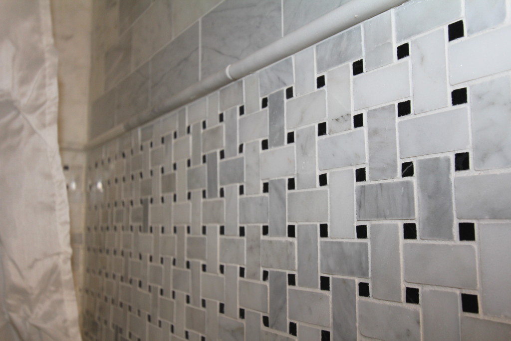
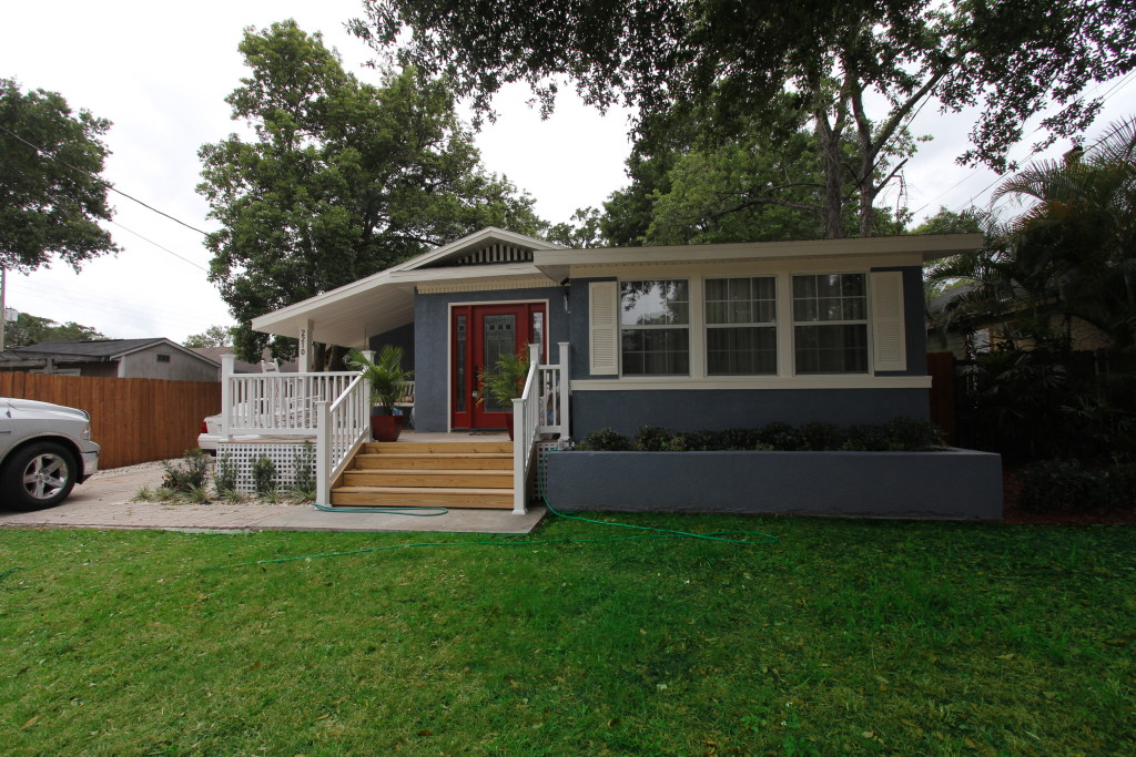
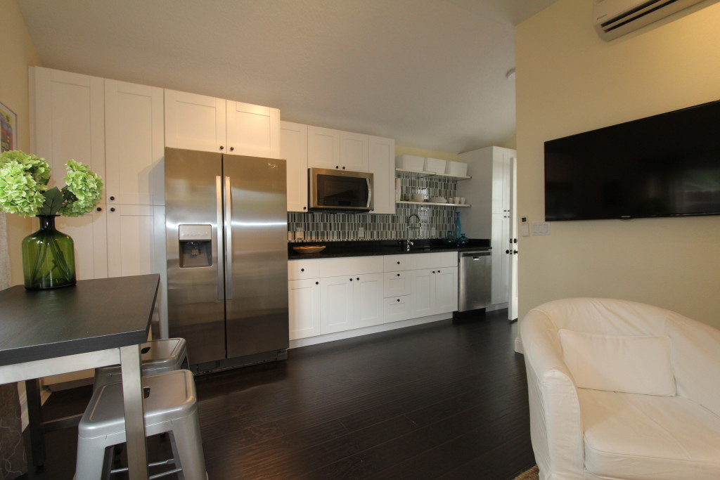
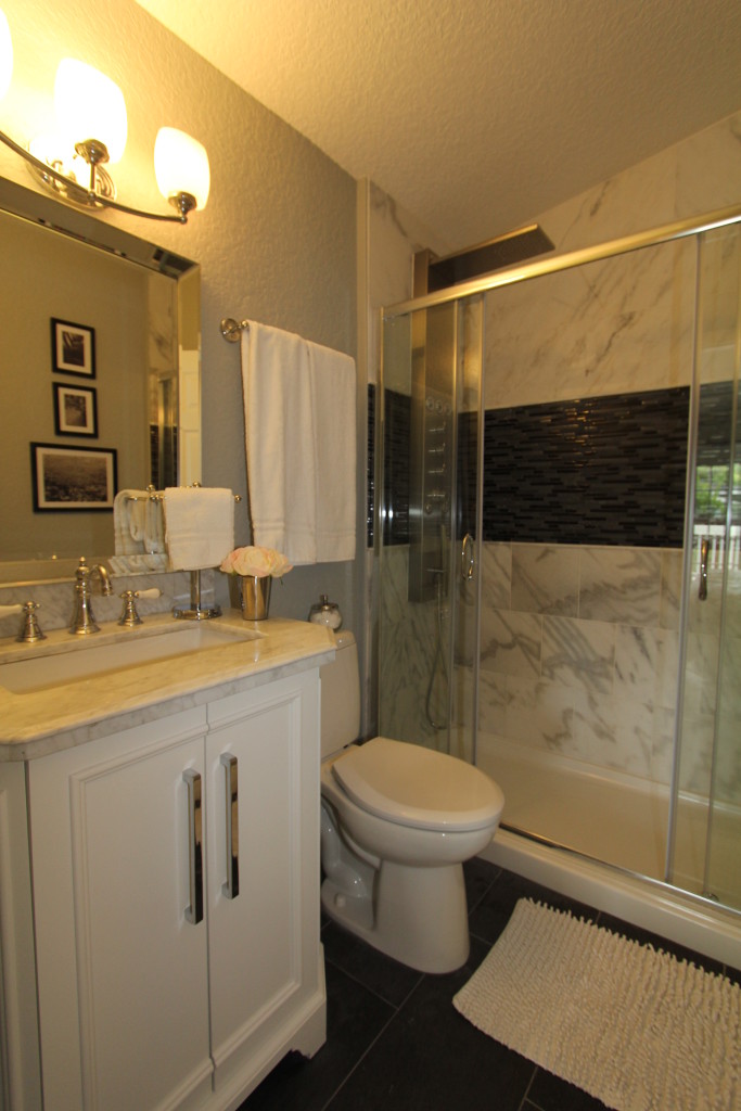
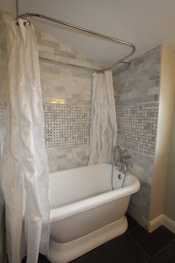
Orlando Bungalow sold after redesign – This 1920’s bungalow sold after a complete rehab. The transformation took a full year after a few setbacks and changes in the architectural plans. The old garage/workshop was transformed into a guesthouse and the main house underwent a full transformation. The staging was set up to show the elegant side of this charming home and give the property some sophistication to attract the younger city dwellers. With a 3 bedroom and 2 full baths in the main house and a self contained guest house with its own bath and kitchen facilities, this house would cater to a family as much as to a couple or a single person. The Orlando interior designer Helene Bonello-Strauss wanted to make sure she has the property set up to speak to a large audience. A house, that is close to a hundred years old, was in itself something special in the central Florida market. With that age it had to show its modern side while maintaining an architectural integrity that would fit a traditional bungalow. The kitchen and bathrooms were gut remodeled and received all new fixtures. While giving the house up to date functionality it was important to the Designer to maintain some classical design elements and materials. The tile are mostly classic white marble with a band of mosaic in the middle of the tub surround. The tub is a freestanding tub with simplified lines that reminds one of the claw foot tub of yesterday. Here Helene wanted to keep a similar form while updating it at the same time. The master received a walk in shower with glass enclosure and a modern multi-jet fixture. The wall tile are also the white marble accented with black glass mosaic inlay. The vanity in the master has quite a traditional appeal with traditional woodwork and a marble sink. New fixtures can be updated but show a homage to traditions at the same time. It is a designers tightrope walk that will be risky. No one wants to spend a small fortune to end up with a dated design. At the same time it may be a mistake to bring in design elements that are in contrast with the architectural integrity of the structure. The ideal solution is to enhance the architecture and take design elements from that same style and era and fuse them to a new identity. If the viewer has the feeling that the design solution is one that was meant to be for the house, the quest was successful. It is not always easy to bring the past into the presence and create something that looks authentic and intentional. Sometimes it needs a bit of imagination and the willingness to look back. In design there is no one-size-fits-all. Good interior design is not only the task of designing for a client or a target audience, but also designing for a specific style. Speaking the same design language as the architect who drew up the plans decades ago, while rejuvenating the appeal can create tremendous value in the eye of the potential purchaser. Don’t hide the style of the house. Take it in and embrace it for a great result. Let the house show its heritage with pride. There is a story hidden in those walls. Listen to the whisper of past decades and bring your version of that story to the surface. You will find that in re-imagining the story of an old house you will uncover many facets of yourself.
See how Realtor (R) Elisa Edwards had her Windermere townhouse listing transformed
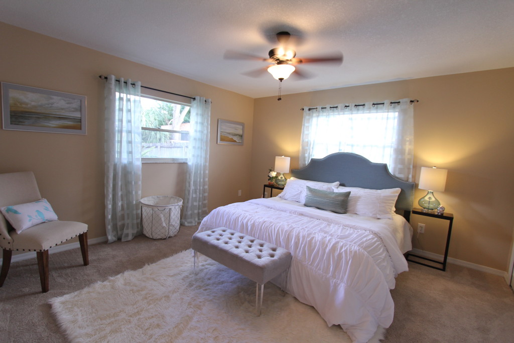
See how Realtor (R) Elisa Edwards had her Windermere townhouse listing transformed – The agent from Watson Realty Corp. had a listing in Windermere on the market for a few weeks when the owners agreed to a drastic transformation. The staging should give the marketing the competitive edge and show the true potential of this newer townhouse. The house got furnished by professional stager Helene Bonello-Strauss. The style used here was a modern look with rustic and eclectic accents – a mix that had shown to be very attractive to a large audience of homebuyers.
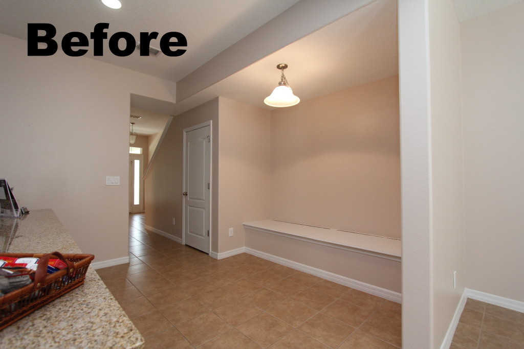
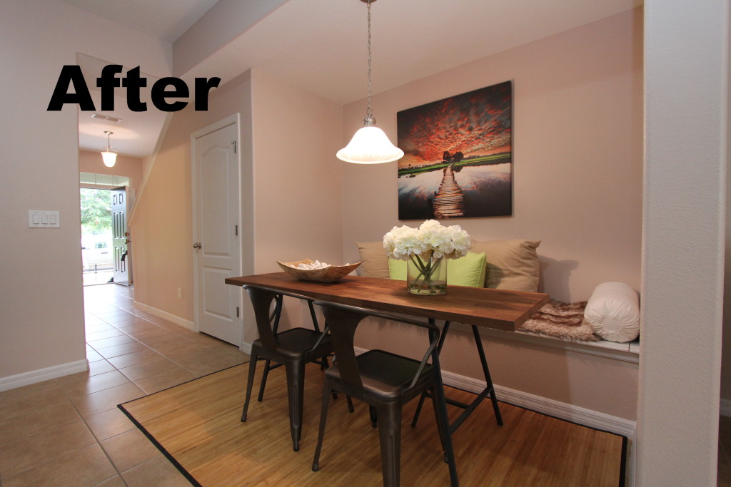
The empty townhouse did not show all that it could be when it was vacant. The owner was happy to hire www.idesigntosell.com to help with the transformation. The open concept living room with an unusual dining space in the kitchen required a good solution to visualize the potential the house has. Most breakfast nooks are set up for smaller round or square dining spaces. This one had a long bench and a narrow space between the breakfast bar and the back wall. Designer Helene Bonello-Strauss found the ideal solution with an elongated table that would sit 4 to 6 people easy. While making the most out of the space it left plenty of room as the traffic area is left wide open.
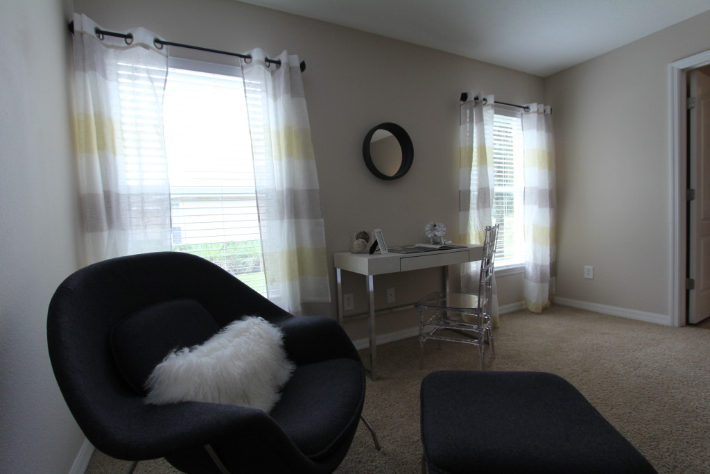
The living room was set up with a fairly large sectional. This shows off the size of the room and leaves enough room for a desk and chair on the back wall. That offer multiple uses for the new owner. The desk can be used to pay bills or for the children to make their homework while the mother is preparing meals. The room is designed in a way that if functions as the social hub for the house with many uses combined in one room.
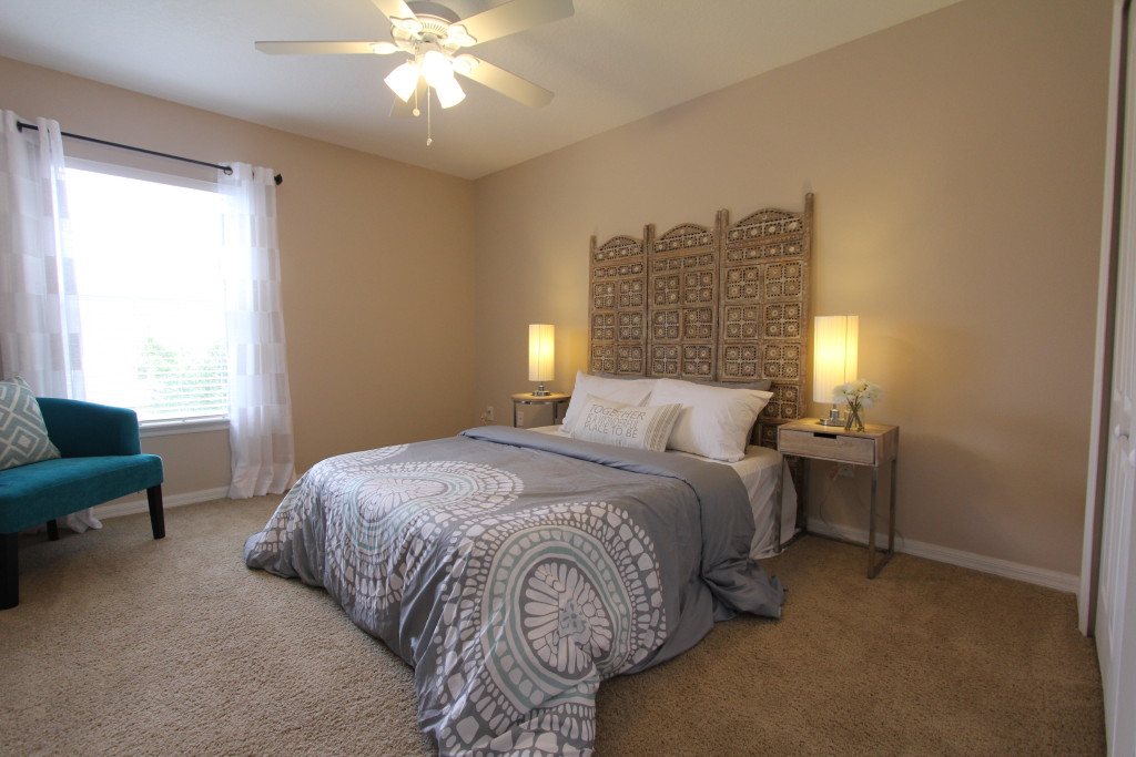
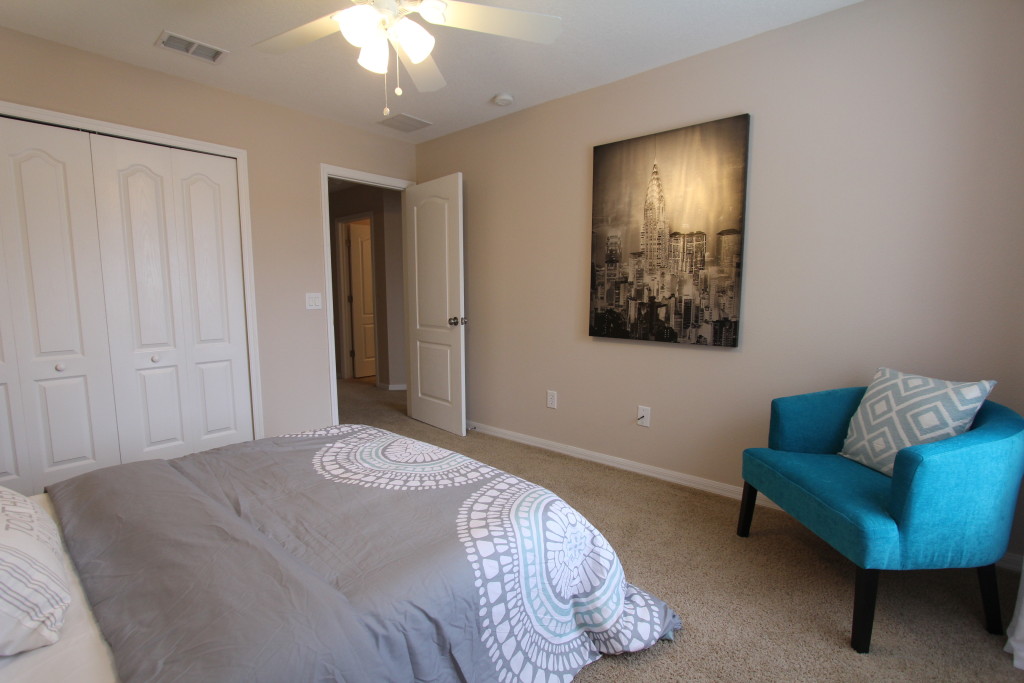
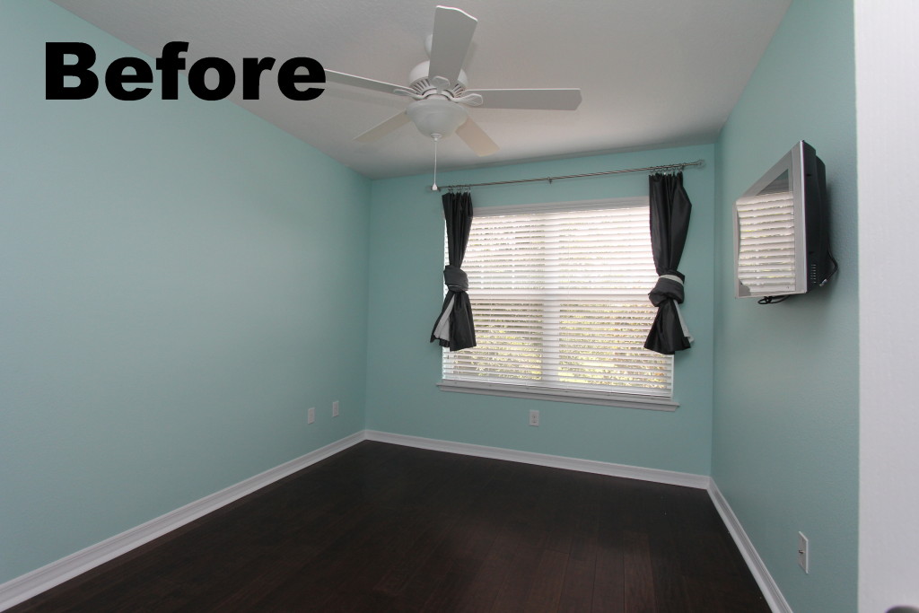
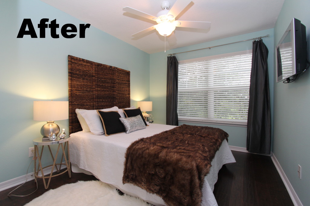
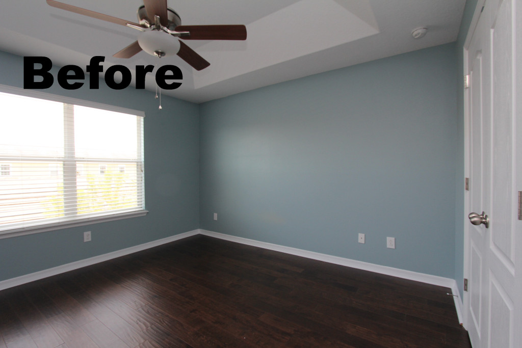
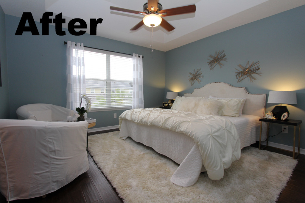
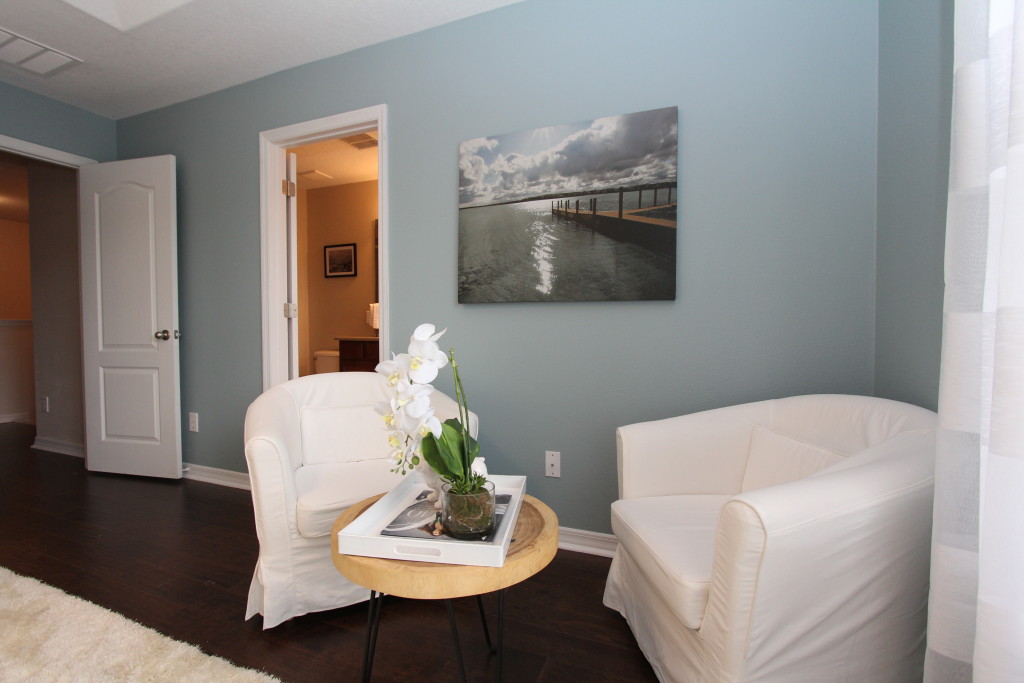
The master bedroom can be described like ‘a day on the beach’. Light blue walls led the way to a fresh and airy color scheme. Instead of chunky dressers Helene chose a set of two chairs covered in white cotton and a small round wood table to create a spot to relax and read a book or have a morning coffee. Having a small settee or a chaise in the bedroom can add additional use to a room that otherwise would be only used for sleeping. This truly transforms a bedroom into a suite.
Anyone interested in this beautiful townhouse contact the agent at www.elisaedwards.com for further information.
Cute two bedroom home sold
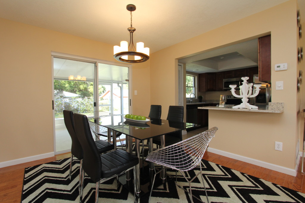
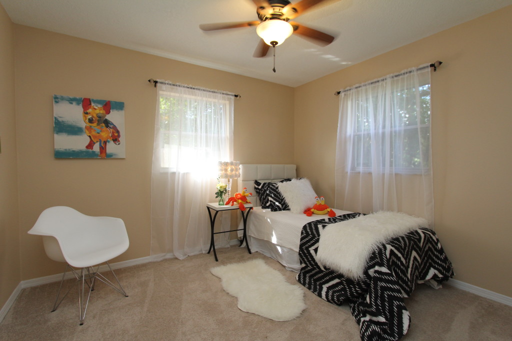
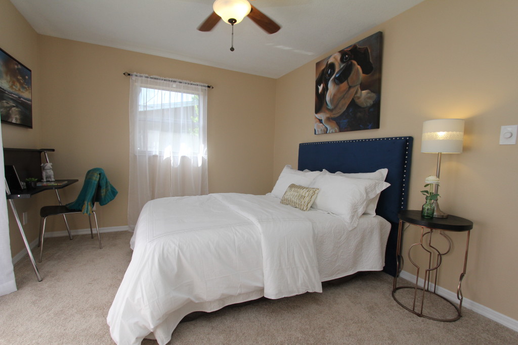
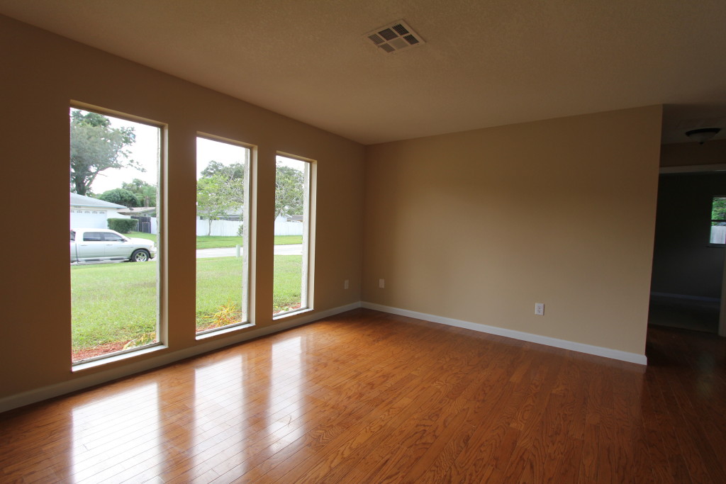
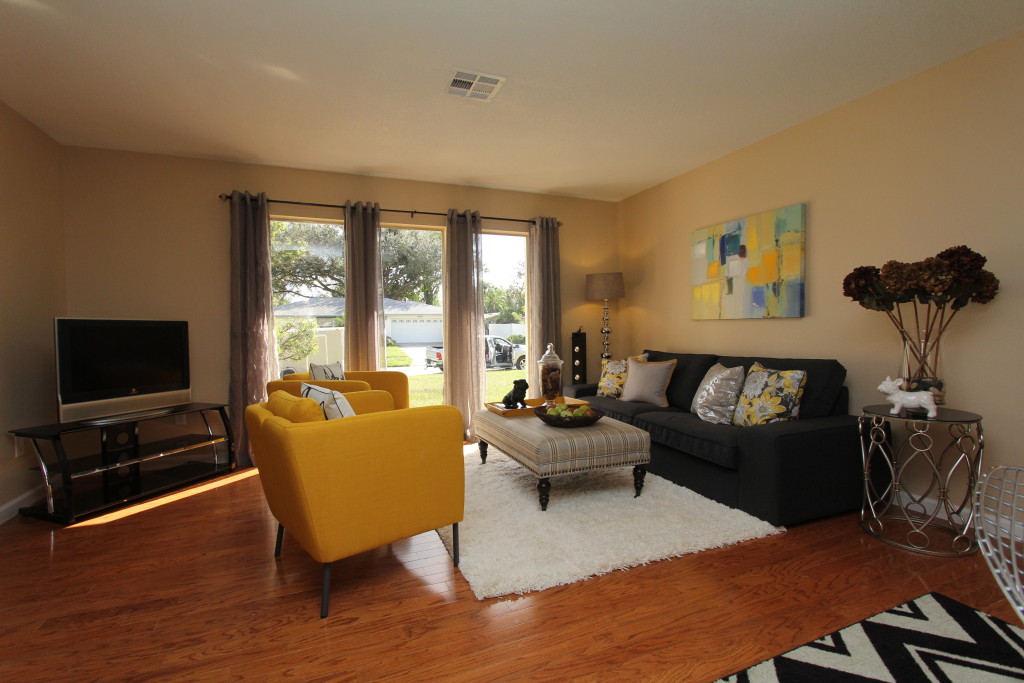
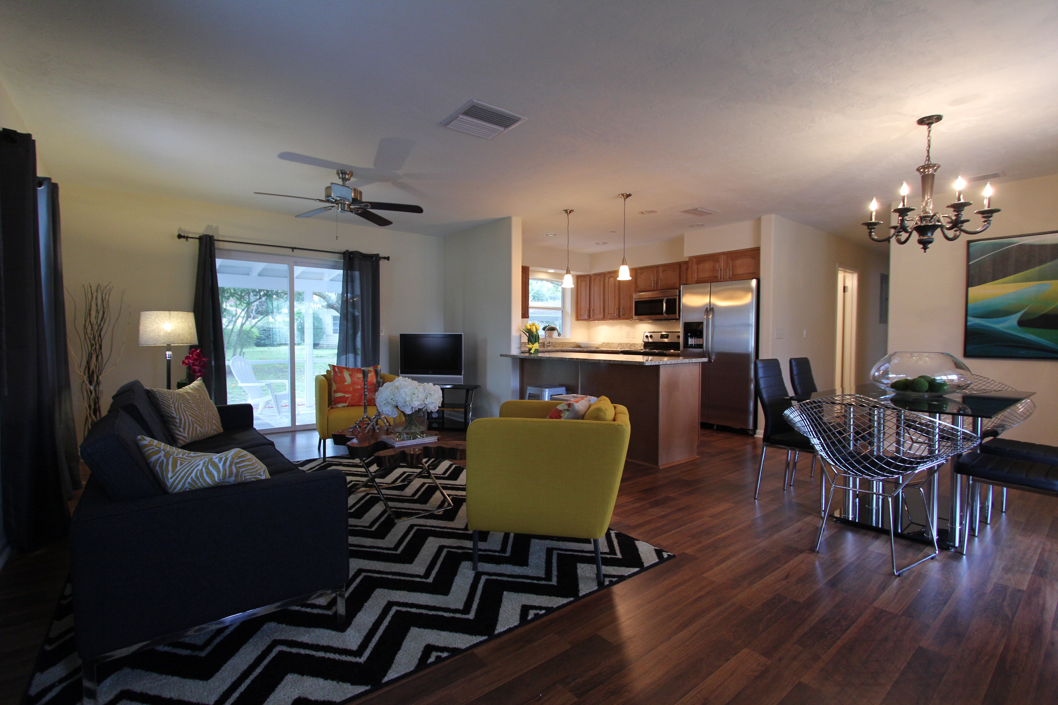
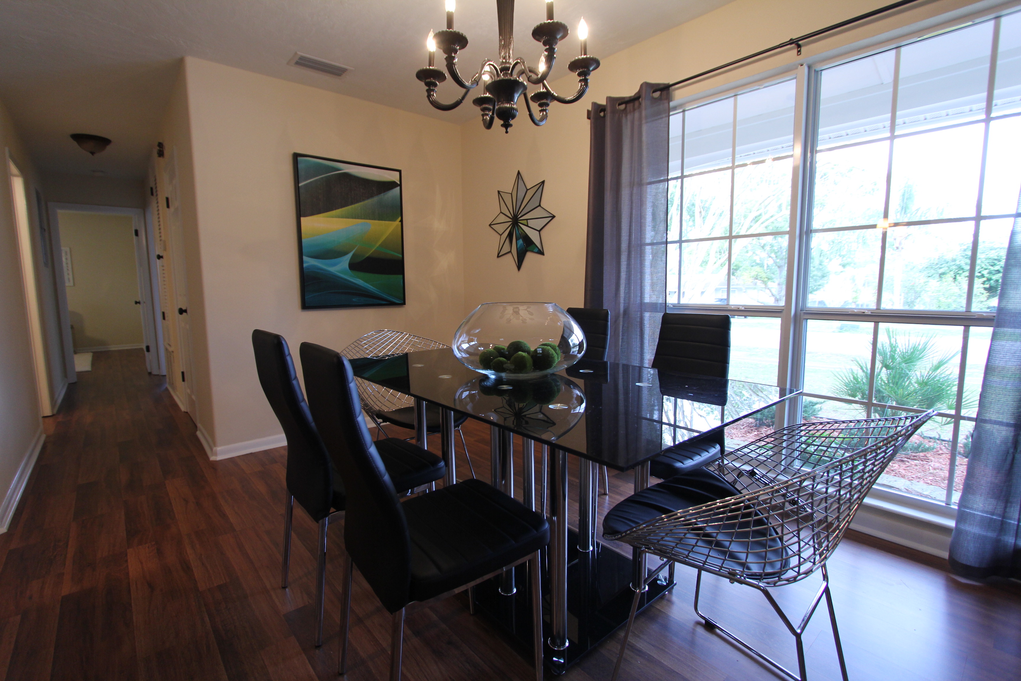
Cute two bedroom home sold – This nicely remodeled two bedroom home underwent a full renovation. This house is proof that with the right furnishings and updates an older house can look great. Fantastic design is not always a matter of size but more a question how the space is utilized. This house has 1200 sq ft living space and presents itself as a very livable home. The fit and finishes are a far cry from the typical run down rentals in the area and speak to a buyer who wants a bit more than the bare minimum. A sophisticated living space like this in another location could be quite costly. Here in West Volusia County a house like this can be owned a very attractive pricing. In this case just under $ 100k was the budget to own it. Nice wood floors and a brand new open kitchen give a spacious appearance to the living area. We chose furniture that has a slim scale. The sofa is a contemporary 3 seater with slim armrests so it takes up less room as traditional roll arm sofa would. The contrasting chairs deliver a pop of color. The yellow accent color is continued with accessories and accent cushions on the sofa and the pendant lights over the kitchen counter. Carrying one or two accent colors throughout the room helps to unify the space and create a seamless design. Especially in an open living room it is important to show a buyer how the space can be utilized. For the dining room we chose a contemporary glass table and slim leather parson chairs as the side chairs. We paired them with chrome end chairs. The chrome mesh leaves them looking light and fresh while the black seat ties in with the other chairs in the set. Not everything has to match in order to look coherent. It often creates some visual interest if the pieces are carefully chosen and have some aspect that ties them together. The overall theme has more of a contemporary vibe. We use a fresher urban design language to contrast the 60’s age of the house. It supports the new renovation and lets the house compete with new construction homes in the area. Despite having only a carport, two bedrooms and one and a half baths, this house sold a hair under asking price. This is truly a small house with a big attitude.
Here a video of the property: